How financial services UX/UI design streamlined cross-border payments and boosted business performance
Project:
the project
Challenge:
Payoneer, a leading financial services firm listed on the Financial Times FT 1000, helps businesses, freelancers, and online sellers manage cross-border payments. Despite its success, the platform’s UX/UI limited efficiency and user satisfaction. Payoneer partnered with Lazarev.agency to apply financial services UX/UI design, aiming to optimize workflows, improve usability, and create a more business-advantageous digital experience.
Approach:
We applied financial services UX/UI design to rethink Payoneer’s platform, creating a user-centric interface that simplifies cross-border payments. Through discovery sessions and collaborative workshops, we identified key user needs, introduced valuable features, and streamlined workflows, ensuring the platform is intuitive, efficient, and aligned with Payoneer’s business goals.
The Project’s
Discovery Phase
Revamping Home screen
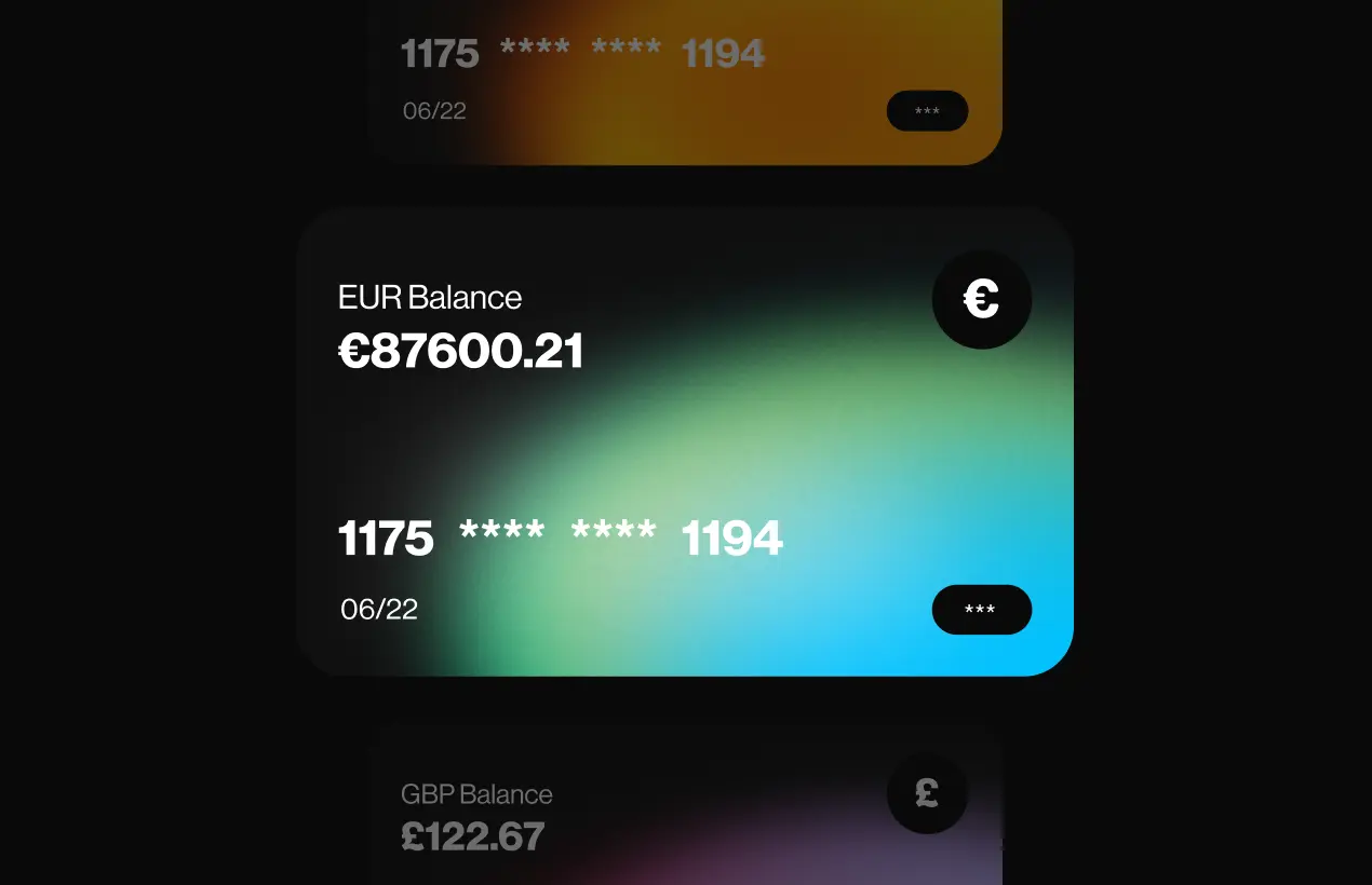
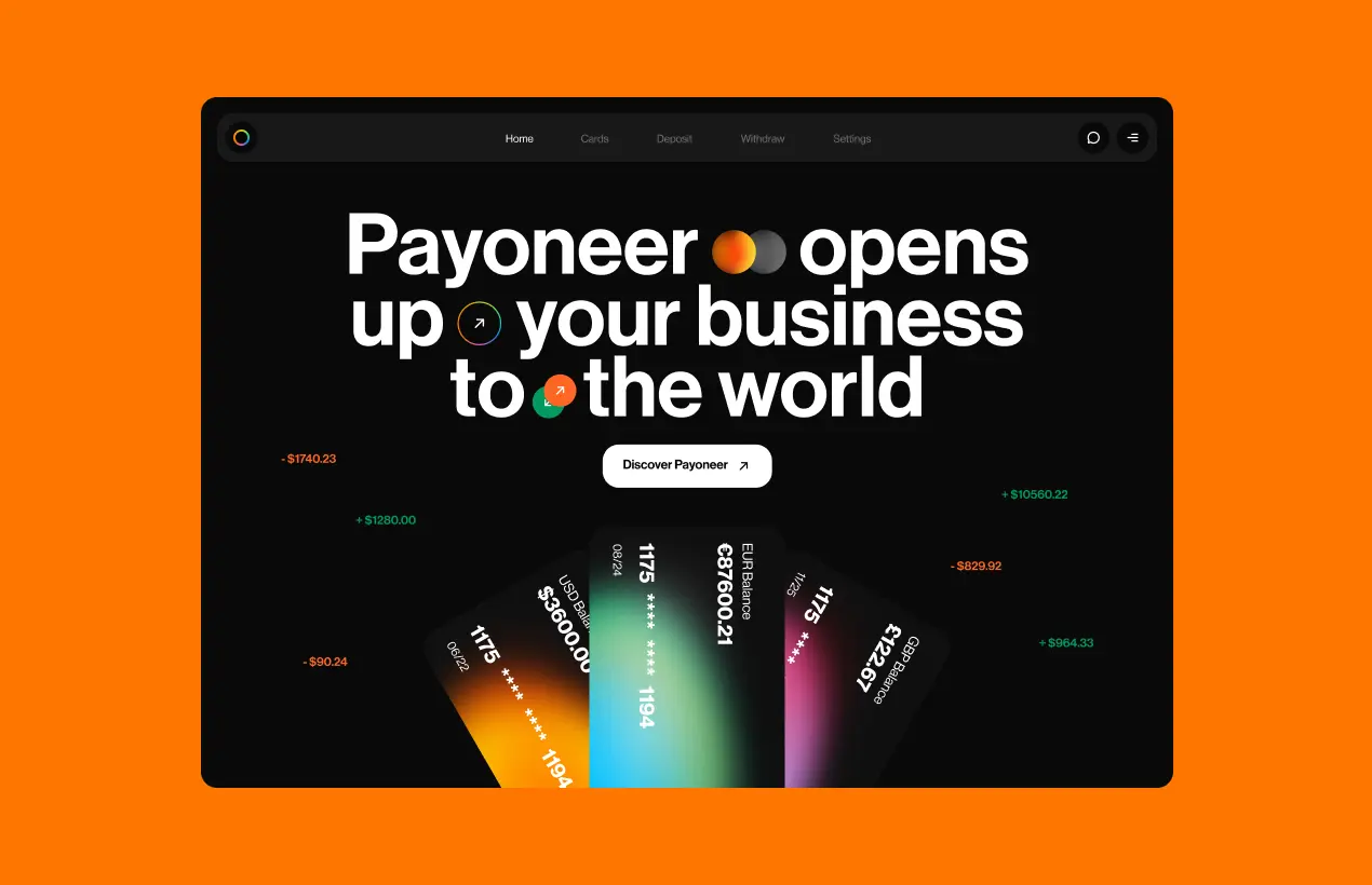
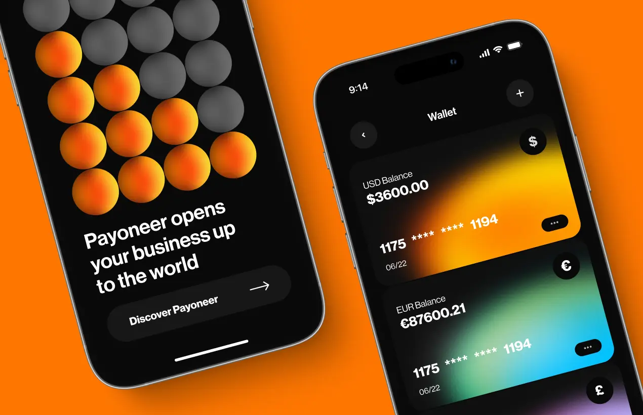
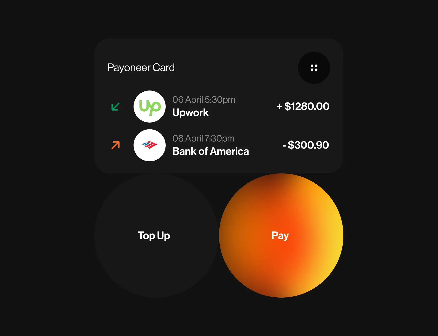
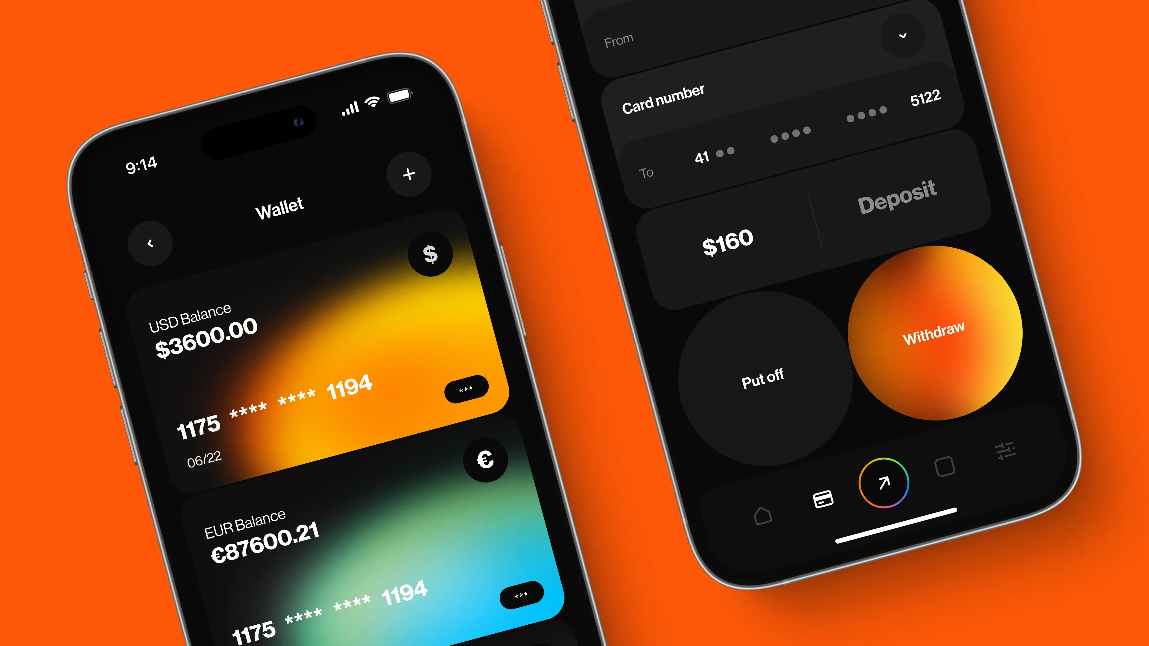
Since the home screen is the main interaction point of Payoneer customer, we placed all the necessary information for managing and monitoring their finances there. This includes features like checking various card balances and viewing recent transactions.
In terms of the visual design, we have maintained the Payoneer brand colors to uphold the relationships that customers have with the brand.
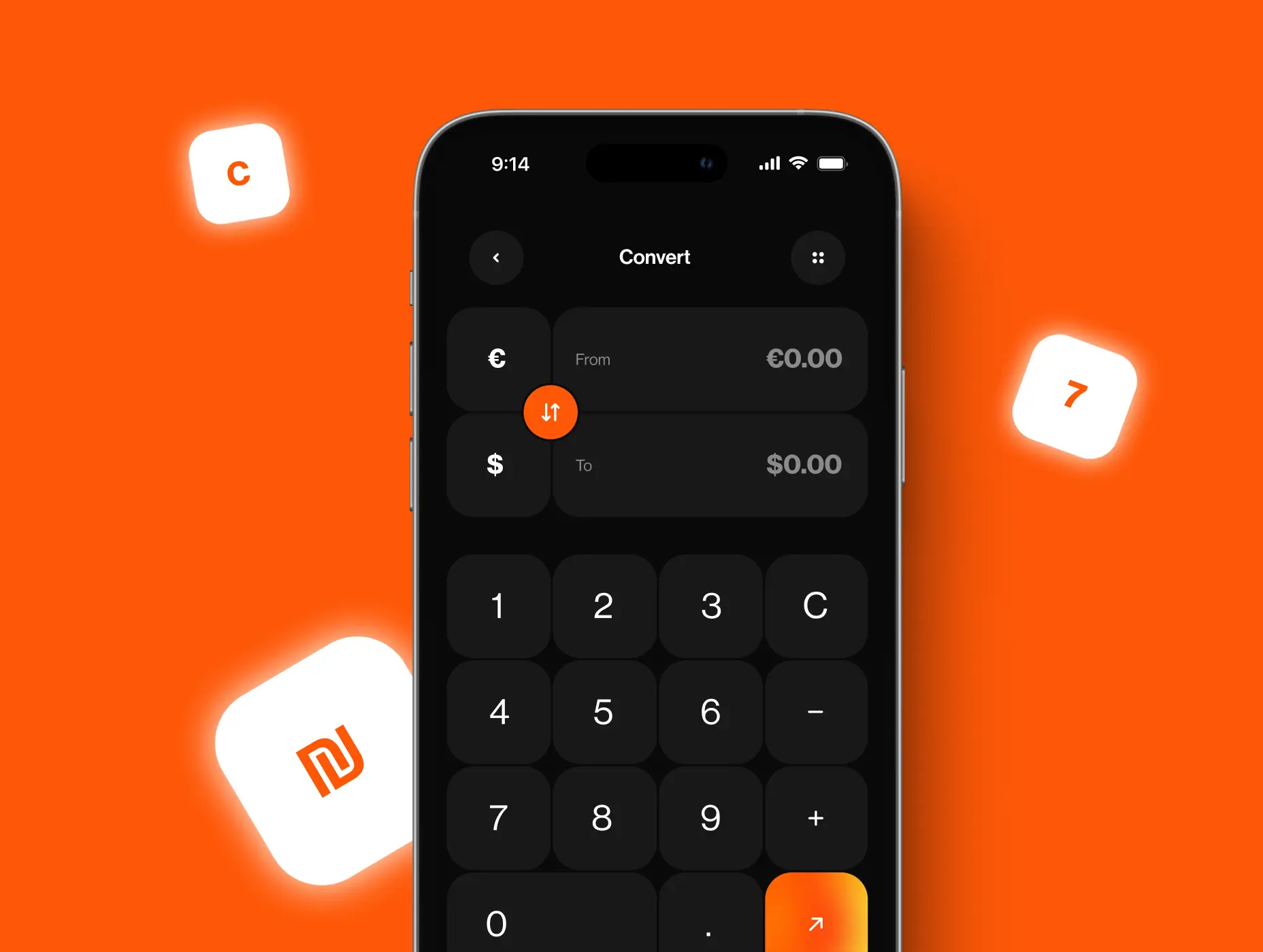
Streamlining the conversion flow
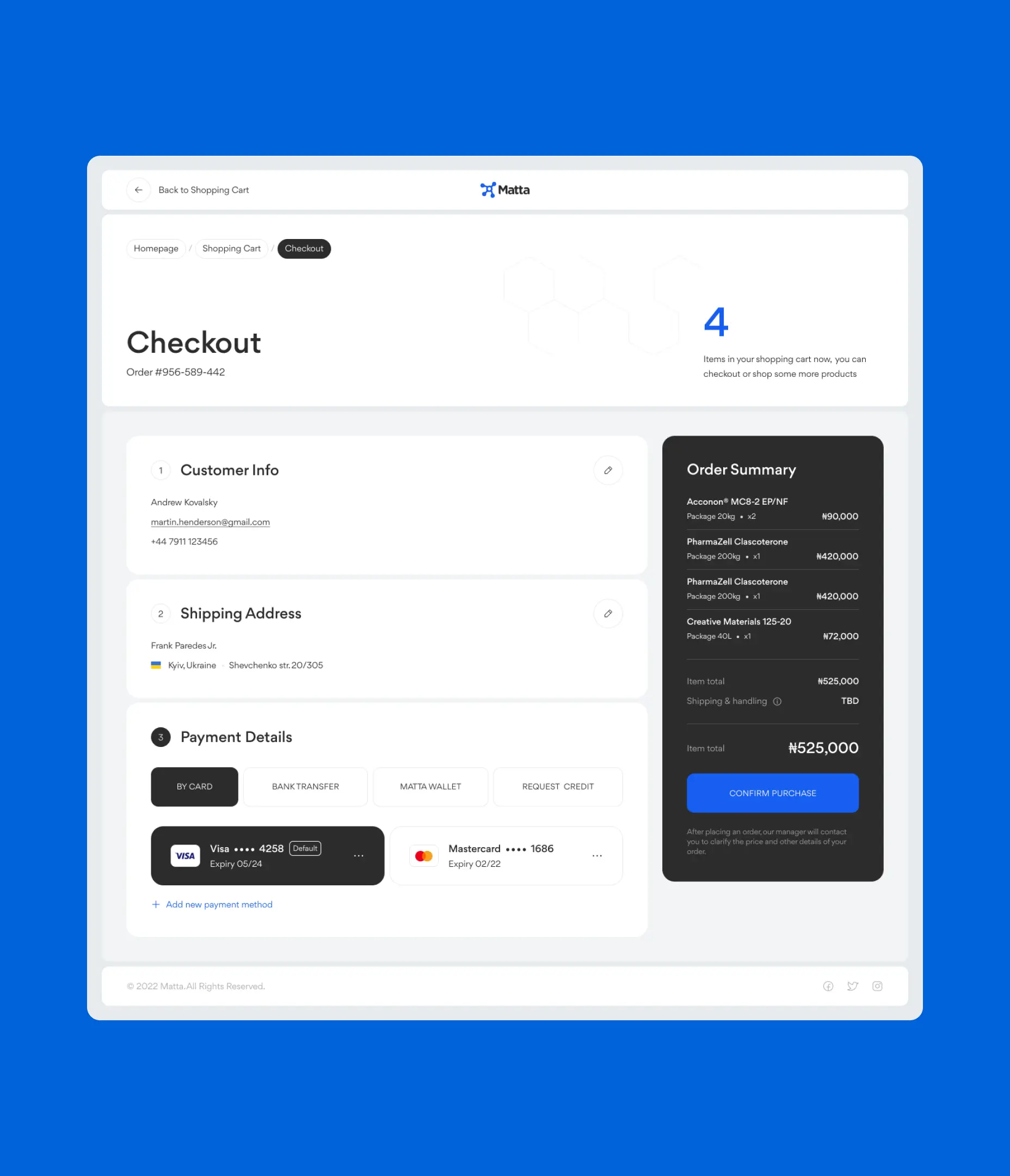
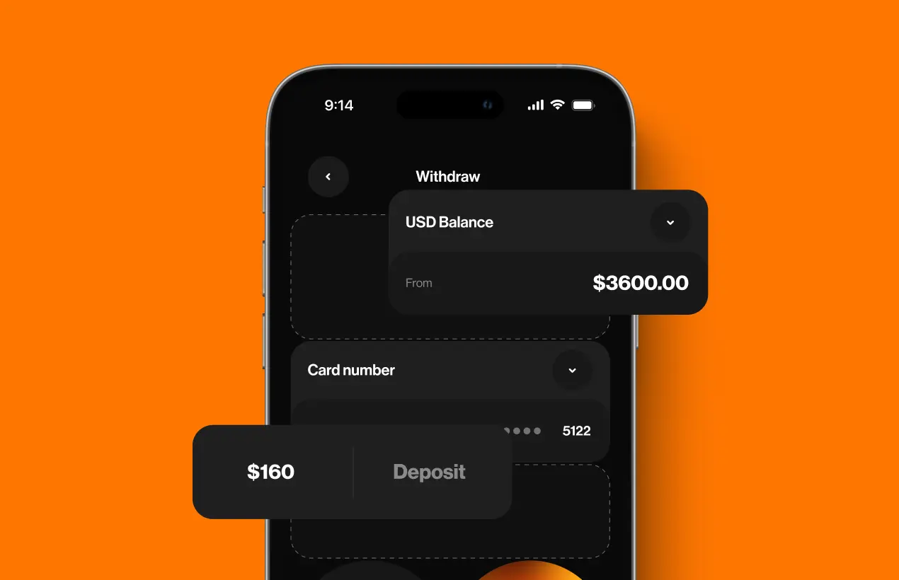
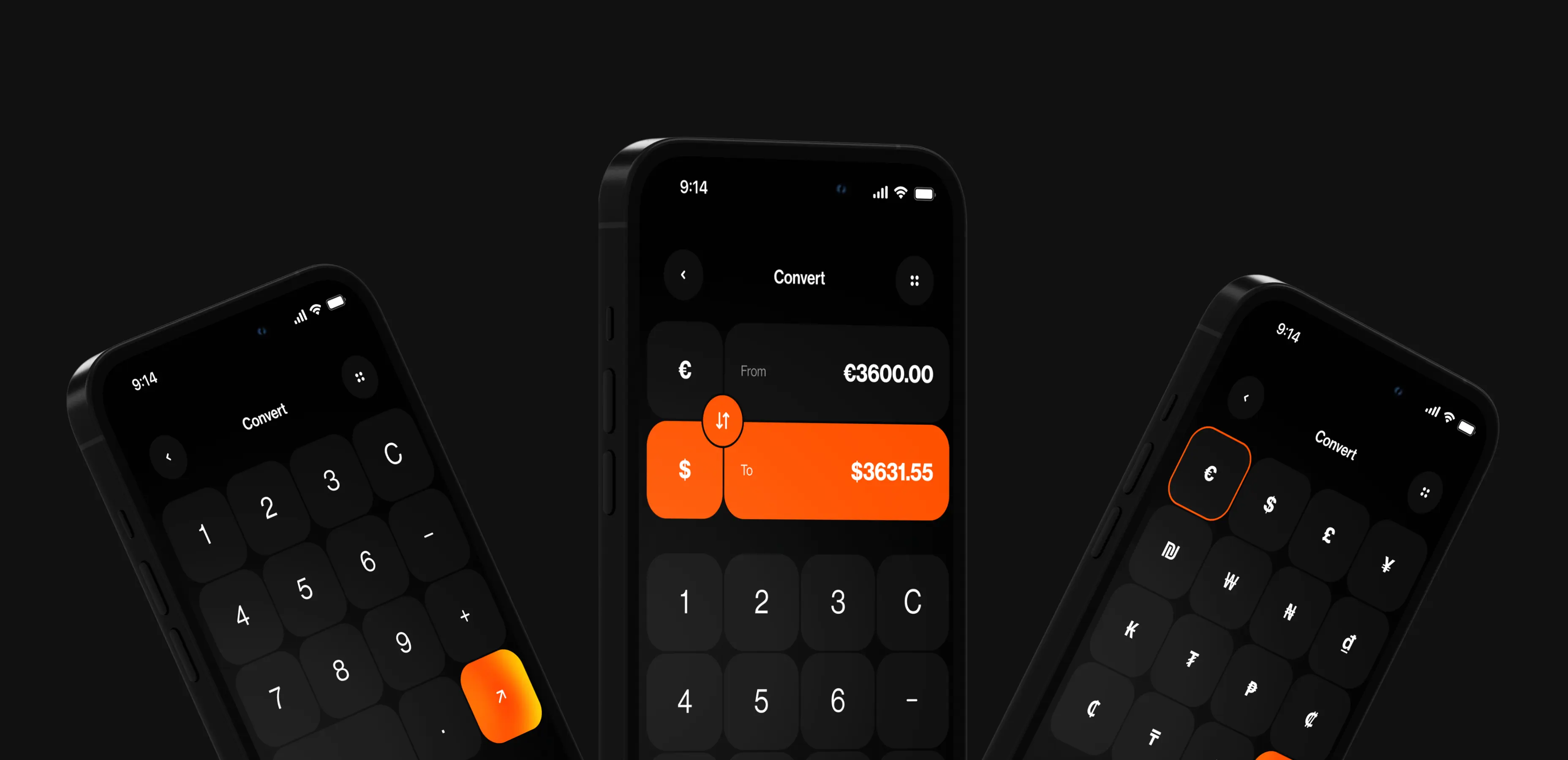
Payoneer currently supports only up to 10 of the world's most popular currencies. Our recommendation is to expand the range of supported currencies to be unlimited, enabling more users to utilize the app, which will contribute to business growth.
Additionally, we introduced an enhanced calculator for data entry, providing instant conversion results even before the actual conversion process.
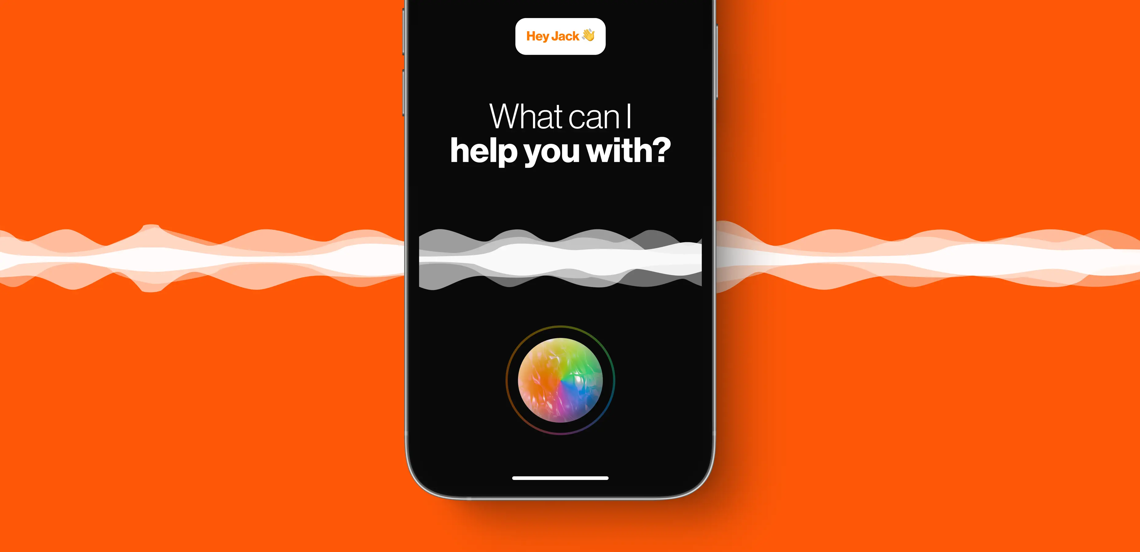
Integrating AI-driven voice assistant
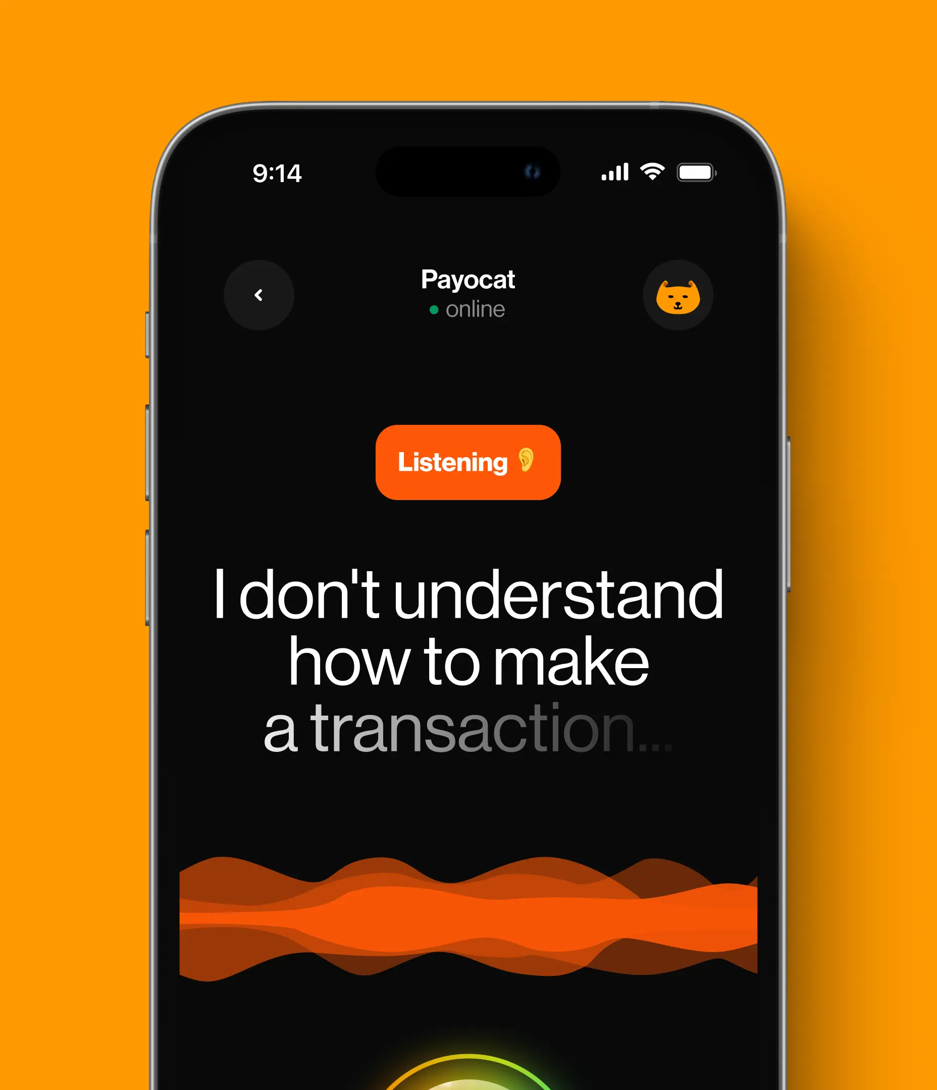
One of the challenges faced by Payoneer is the high volume of customer support requests resulting from an unclear UX. To address this issue, we implemented an AI-driven voice assistant. This NLP technology is responds to user queries on common questions or redirects the customers to the support team. This feature is supposed to significantly reduce the time it takes for people to seek assistance, thanks to the decrease in call volume.
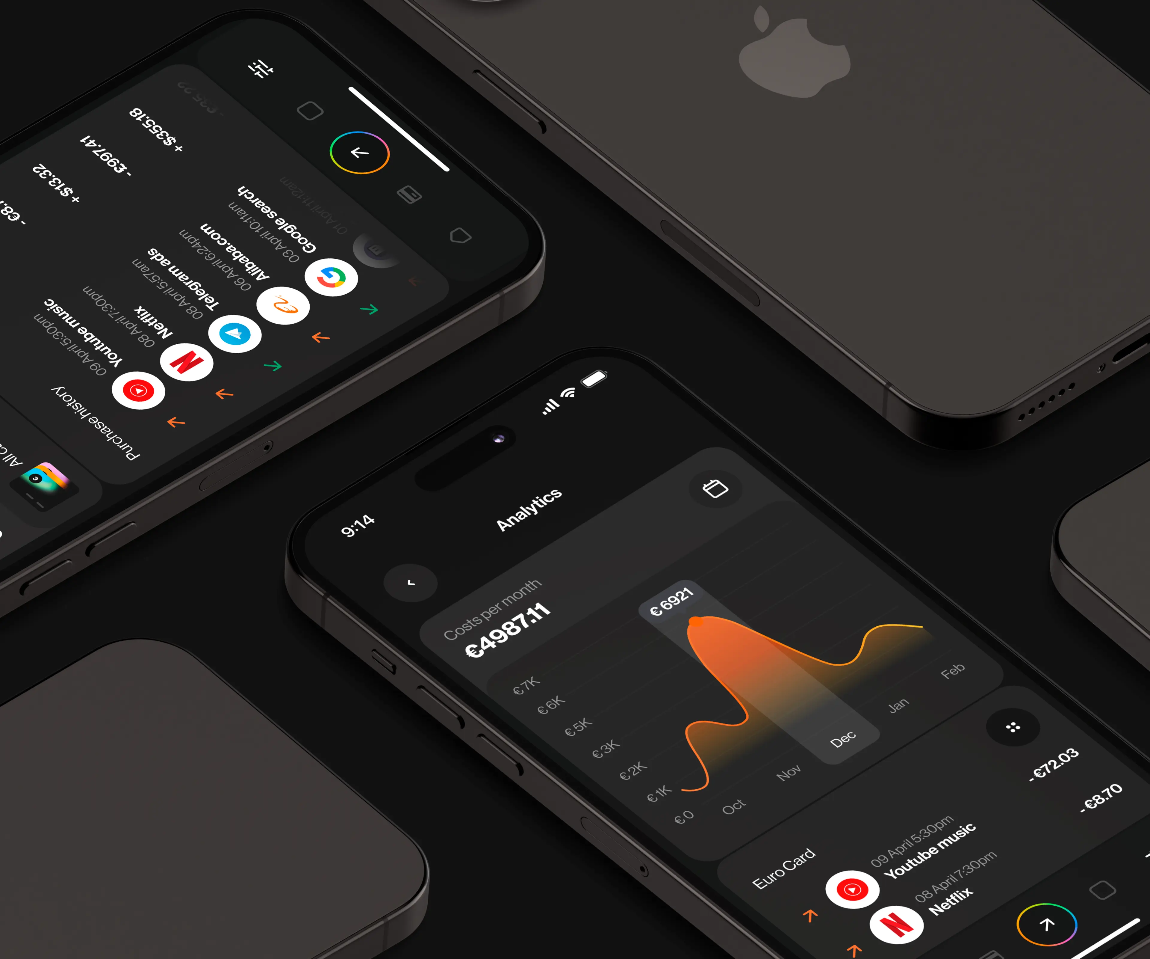
Increasing engagement rates through analytics
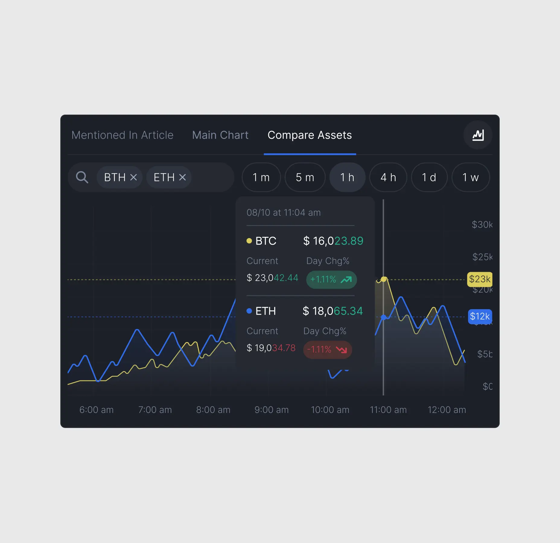
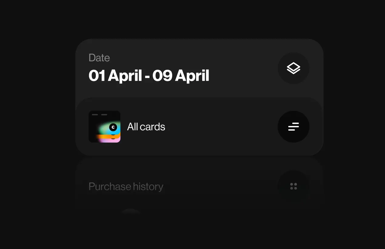
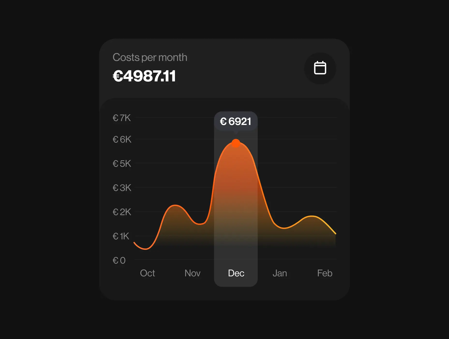
Since Payoneer app users were unable to monitor their spending, they had to resort to third-party solutions, resulting in a loss of traffic for the platform. To prevent this, we decided to offer users an analytics and statistics report on their financial expenditure.
Adding gamification: Payocat mascot
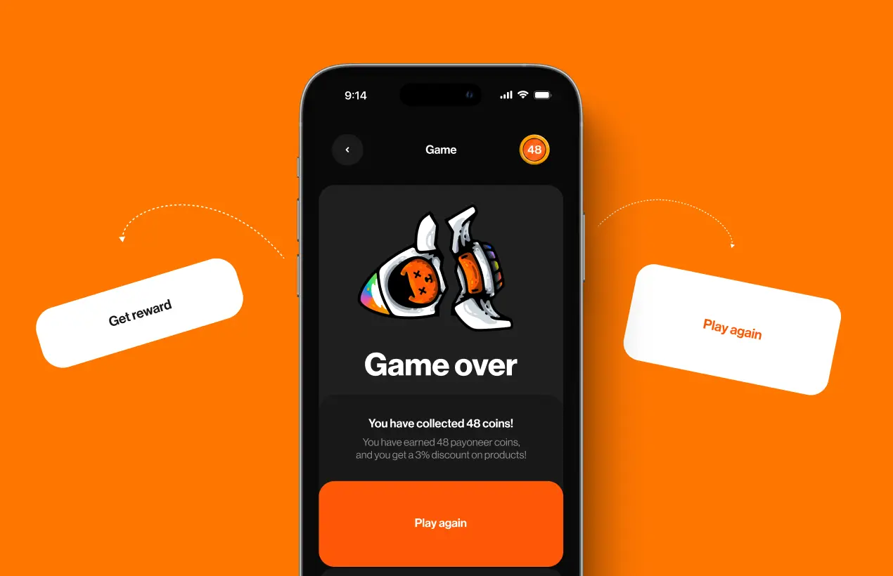
To inject an element of enjoyment into the app, we introduced a game, aligning with our primary objective of increasing user engagement and retention rates.
Our team brought to life a game character named Payocat, serving as an engaging mascot and an iconic part of the brand.
Our aim was to strike a balance, ensuring the game was both user-friendly and challenging to maintain user interest. The rules were kept simple: collect as many Payoneer coins as possible while evading numerous obstacles. The more coins users gathered, the greater the discount they earned on Payoneer services.
Fintech
Lazarev. agency offers comprehensive digital design services. Discover our range of related expertise supported by impactful case studies.







.webp)


