Our decade of delivering outstanding website designs
If you're a business looking to:
Create exceptional user experience with intuitive, conversion-focused website design
Elevate your brand with powerful visual identity and UI solutions
Stand out from competitors with unique, brand-aligned visual solutions
Lazarev+Website Design powers your online success with distinctive, conversion-optimized design.
Check the success stories of our clients below.
for our clients
our excellence
Recognised
Fast company, .INC
KIN Foundation
Kin is a platform that aims to build a community of like-minded people who are interested in exploring the possibilities Web3 presents. It’s a marketplace and a social network allowing members to communicate, create, promote, and build NFTs and apps for the industry.
case study
Key insights into Kin:
Working from the early days of Web3 popularity, it was important for Kin to build a visual presence that stands out from the crowd. In order to achieve that, we had to perform research that helped us uncover what users respond to — a style that feels both welcoming, but also exciting and cutting-edge.
Since Kin consists of multiple modules and applications, it was important to build an ecosystem that can accommodate the scaling of the feature set in the future.
Half Past Nine
Half Past Nine is a growth marketing company that helps scale-up and enterprise brands build and execute acquisition, and revenue expansion marketing activities.
case study
Key insights into design solutions:
The site features a clean and modern design that is easy to navigate, ensuring that users can access the information and tools they need quickly and efficiently.
Our solution is designed to make the site flexible and scalable, with a range of features that can be customized to suit each client's specific needs and goals.
TradeGuru
Energy Guru Group moves physical energy from where it is sourced and stored to where it is demanded most, using the most logistically-efficient means possible: ships, rail, trucks, and pipelines.
case study
Key insights into design solutions:
The company positions itself as a global partner in trade. During development, the emphasis was placed on a clean, minimalistic and strict design that corresponds to trends and is suitable for any target audience.
A simple structure and large fonts make the site accessible for reading information from any device. Visualization of products to show the scale and diversity of the company's products
Accern
Accern is a leading fintech company that harnesses the power of AI to provide transformative solutions for financial institutions, corporations, and individual investors. By analyzing vast amounts of data, Accern delivers critical insights into real-time events that can impact markets, companies, and industries.
case study
Key insights into AI+Financial Research:
By leveraging advanced natural language processing and machine learning algorithms, Accern is able to extract valuable insights from vast amounts of unstructured data, providing clients with a unique competitive advantage.
Accern's real-time sentiment analysis allows clients to make informed decisions faster than ever before, enabling them to anticipate and respond to market events in a timely manner.
By providing different products with unique specifications, it is important to demonstrate their uniqueness and capabilities without dissolving them within the system. Separate landing pages allow you to get acquainted with each product separately.
MarieMur
Mariemur is a sleek, modern platform designed to captivate and entice users with its stunning display of premium lingerie and accessories. The landing page presents a bold, luxurious aesthetic that immediately grabs attention, offering a variety of leather and latex options aimed at empowering individuals to express their authentic selves.
case study
Key insights into design solution:
The use of high-quality visuals and large, bold typography throughout the landing page contributes to a luxurious and immersive experience, making the user feel instantly drawn into the world of high-end lingerie.
The color scheme, predominantly black, paired with sleek, minimalistic navigation, creates a modern, sensual aesthetic that reinforces the brand's identity and appeals to users seeking sophistication and boldness.
Incorporating interactive call-to-actions at multiple points across the page ensures that users remain engaged and are encouraged to act on impulse, enhancing conversion rates.
AI Infra Summit
The AI Infra Summit is the premier event for data scientists, machine learning engineers, and technology leaders who are driving the future of AI. Hosted by AI Infrastructure, this one-day conference brings together experts from across the industry to share insights, best practices, and emerging trends in the field of machine learning infrastructure. From architecture and scalability to security and governance, the Summit offers an opportunity for attendees to stay at the forefront of AI development and unlock new opportunities for innovation.
case study
Key insights into design solutions:
The AI Infra Summit offers a unique opportunity to connect with and learn from leading experts in the field, gaining valuable insights into the latest trends, challenges, and opportunities in AI infrastructure. Demonstration of possibilities with the help of different key messages for interest and satisfaction of answers
Brightness, dynamism and volume demonstrate the uniqueness of the summit, attract attention and highlight the event in a busy environment of information and advertising.
Development of a visual style and its support at all stages from digital to print materials, allowed to create a holistic line of brand perception and immerse into the space AI Infra Summit
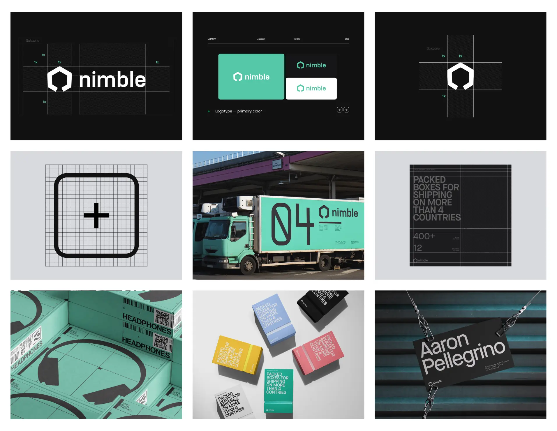
Nimble
Nimble.ai is a leading artificial intelligence company that specializes in providing cutting-edge solutions for various industries. From risk management to supply chain optimization, Nimble.ai leverages advanced technologies such as computer vision and natural language processing to deliver powerful AI-driven solutions that help businesses stay ahead of the competition. By combining their deep expertise in AI with a keen understanding of the unique challenges faced by different industries, Nimble.ai is helping to shape the future of business and drive transformative change across a wide range of sectors.
case study
Key insights into AI:
Innovative Approach: By combining advanced AI technologies with industry-specific expertise, Nimble.ai is leading the way in creating custom solutions that address unique challenges and opportunities across multiple industries.
Data-Driven Decisions: With a focus on data-driven decision-making, Nimble.ai's products and services provide powerful insights.We visualized all processes so that companies could make more informed and effective choices.
Disruptive Technology: Nimble.ai's use of advanced AI technologies, such as computer vision and natural language processing, has the potential to disrupt traditional approaches to business challenges and provide transformative solutions for their clients.
11 Sight
11sight is a pioneering technology company that is transforming the way businesses engage with their customers. 11sight offers an integrated suite of solutions that enable companies to enhance customer experience, improve service quality, and boost revenue.
case study
Key insights into design solutions:
With a focus on user-friendliness and scalability, 11sight's solutions are redefining the way businesses interact with their customers, delivering a seamless and personalized experience every time.
Intelligent chatbots that streamline communication analytics that uncover new opportunities, 11sight empowers organizations to make more informed decisions and drive growth.
We fused storytelling and animations to reflect the innovative nature of the product while adding a human touch to the site.
Mannequin
Mannequin delivers an innovative solution for apparel brands, offering AI-generated photorealistic models for product catalogs. The platform streamlines the process of creating high-quality images, enabling brands to showcase their clothing with diverse models without the hassle of traditional photoshoots. With customizable appearances, brands can effortlessly align model features with their brand identity. The service promises delivery of images within just a few business days, eliminating the need for managing logistics and hiring models.
case study
Key insights into design solution:
Interactive design plays a pivotal role in showcasing the flexibility of the AI models. Users can explore the customization options by dynamically changing the model's appearance and clothing, making the experience engaging and intuitive.
The emphasis on high-resolution, human-like images supports a more engaging online shopping experience. These visuals not only enhance product presentation but also increase consumer confidence, leading to higher conversion rates.
NODO
A promo website for unique cinematography equipment. Inertia Wheels MAX – the first-hand wheels developed to streamline the operating experience.
case study
Key insights into design solution:
Using engaging interactions, we sparked curiosity and helped users recognize the value of the Wheels, leading to increased waitlist sign-ups
Presenting several ordering options gave existing and new customers the freedom of choice and help them make informed buying decisions through in-depth offerings explanations
Through rich interactions, 3D renders, and digestible copy, we showed off the unique physical features of the Inertia Wheels MAX, driving demand, and encouraging our audience to explore the product further


.webp)


