EdTech design services that make learning flow
At Lazarev.agency, we fix what holds EdTech platforms back — cluttered systems, confusing UX, and admin-heavy tools. As a leading EdTech design agency, we build intuitive, scalable, and learner-centered products that enhance educational experiences and exceed user expectations. From learning management systems to educational apps, our UX/UI design helps learners, educators, and institutions thrive.
We embed AI and adaptive learning only where it adds real value guiding learners at their own pace, personalizing content, and improving progress tracking without adding friction.
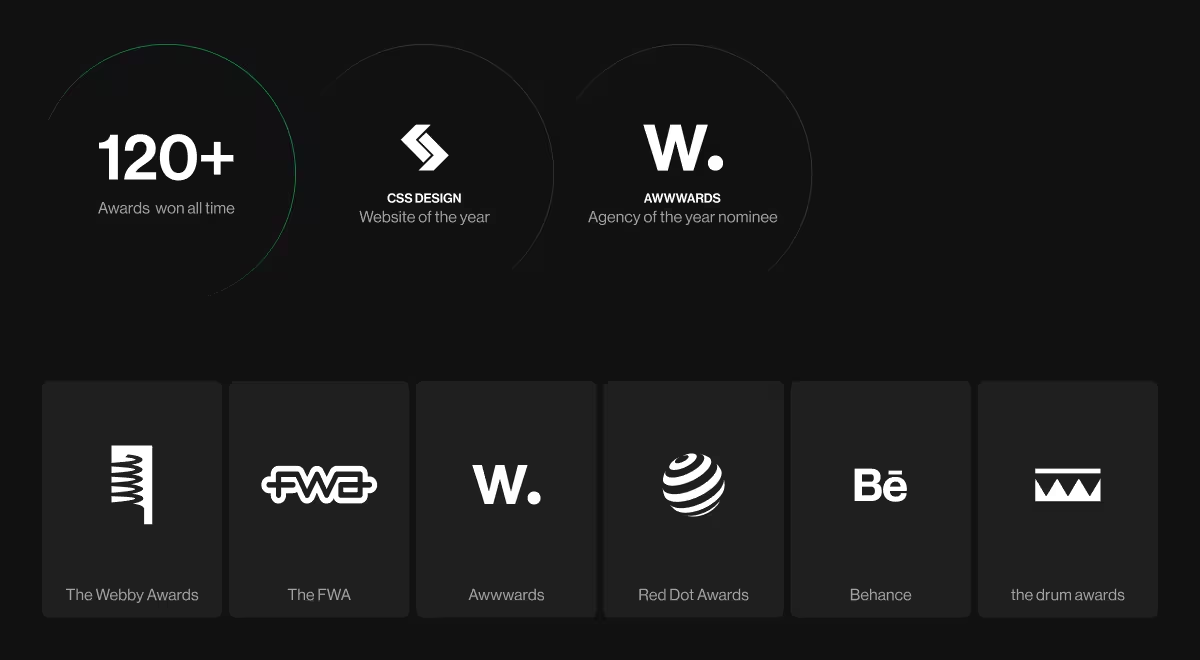
When the industry hands out its highest recognition, we’re the ones holding it

Why education products fail and how we solve it
Learners don’t know where to start
We design clear entry points and contextual guidance that simplify onboarding and keep students focused.
Low course completion rates
Our UX design in education solutions introduce pacing cues, progress indicators, and subtle motivation triggers that reduce drop-off.
Same interface for every learner
Through adaptive education UX design and personalized learning, each user gets just the right level of support.
Scaling means redesigning
We build modular design systems that evolve with your EdTech platform, enabling continuous improvement and easy feature growth.
Our approach to designing EdTech that actually gets used
- Research starts with learners. Every project begins with deep user research, user interviews, and usability testing to identify real behavior patterns and unmet needs.
- Structure before style. We prioritize clear information architecture and logical flows before visuals to create user-friendly interfaces and easy access for diverse roles.
- AI as an invisible tutor. We apply AI-powered personalization for content recommendations, progress tracking, and decision-making, ensuring smarter learning outcomes.
- Design systems that scale. Our custom solutions support rapid updates, new courses, and changing educational standards without breaking consistency.
- Collaborative process. We work closely with your in-house team to build tailored EdTech solutions — from web design to mobile apps — that align with product strategy and business goals.
What we offer in EdTech UX design
- Adaptive learning design – interfaces that adjust to user pace and progress.
- Gamified engagement – learning motivation through subtle, goal-driven interactive elements.
- Mobile learning UX – responsive e-learning platform design optimized for students on the move.
- Learning dashboards – actionable data visualization that helps both educators and learners make informed decisions.
- Modular content systems – reusable components that speed up updates across large-scale education platforms.
The AI edge in educational technology
We’ve been building AI UX EdTech design projects since 2017. Our experience in UX design in education gives us a deep understanding of how technology shapes behavior.
We use machine learning, augmented reality, and personalized recommendations to create interactive content that keeps learners engaged and turns EdTech companies into long-term innovators in the dynamic EdTech market.
Client stories that speak louder than awards
Recognition is great, but client results are greater. Hear from the teams who’ve scaled with our design.
“Lazarev. fostered a positive engagement by delivering a navigable site that allowed users to absorb information quickly. The team led a thoughtful, efficient workflow that was always prepared for meetings.”
{{Boyd Hobbs}}
“Through a detailed understanding of the client’s platform, Lazarev. was able to create a clean and intuitive UI/UX design that ticked all the boxes. The team was receptive to all requirements and requests and adapted well to timeline changes. They produced accurate mockups at every iterative stage.”
{{Tommy Duek}}
Why Lazarev.agency
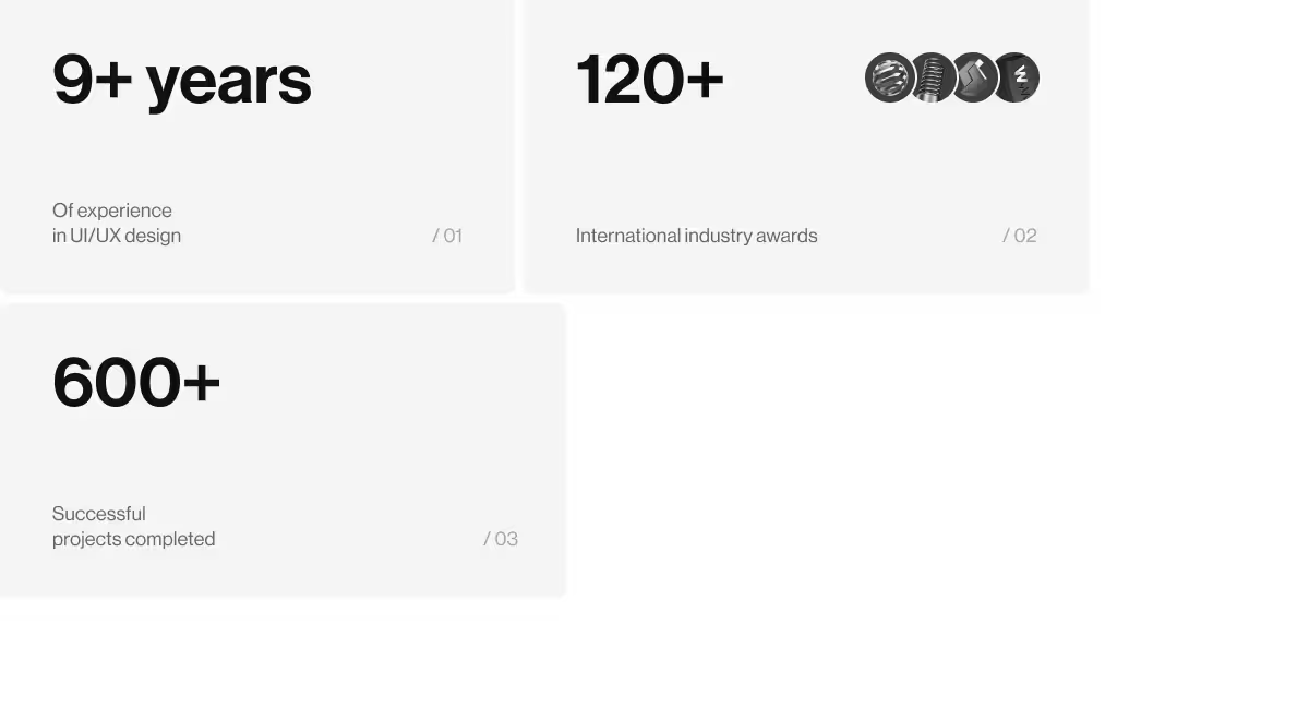
Since 2015, we’ve delivered 600+ design solutions across the education sector and other industries. Our EdTech design services combine sharp UX thinking, technical precision, and business strategy.

We help EdTech innovators build platforms that foster retention, improve learning experiences, and deliver measurable results.
Whether you’re building a new EdTech platform or redesigning an existing one, our custom design process ensures a seamless user experience that supports students, educators, and administrators alike.


.webp)


