Nonprofit web design agency that turns missions into movements
At Lazarev.agency, we design nonprofit websites that drive donations, inspire supporters, and amplify your impact. As a full-service nonprofit web design agency, we combine human-centered design and digital strategy to transform your cause into meaningful action.
Whether you’re raising awareness, growing your supporter base, or launching a new website, our team ensures every page inspires trust, tells your story, and drives measurable results.
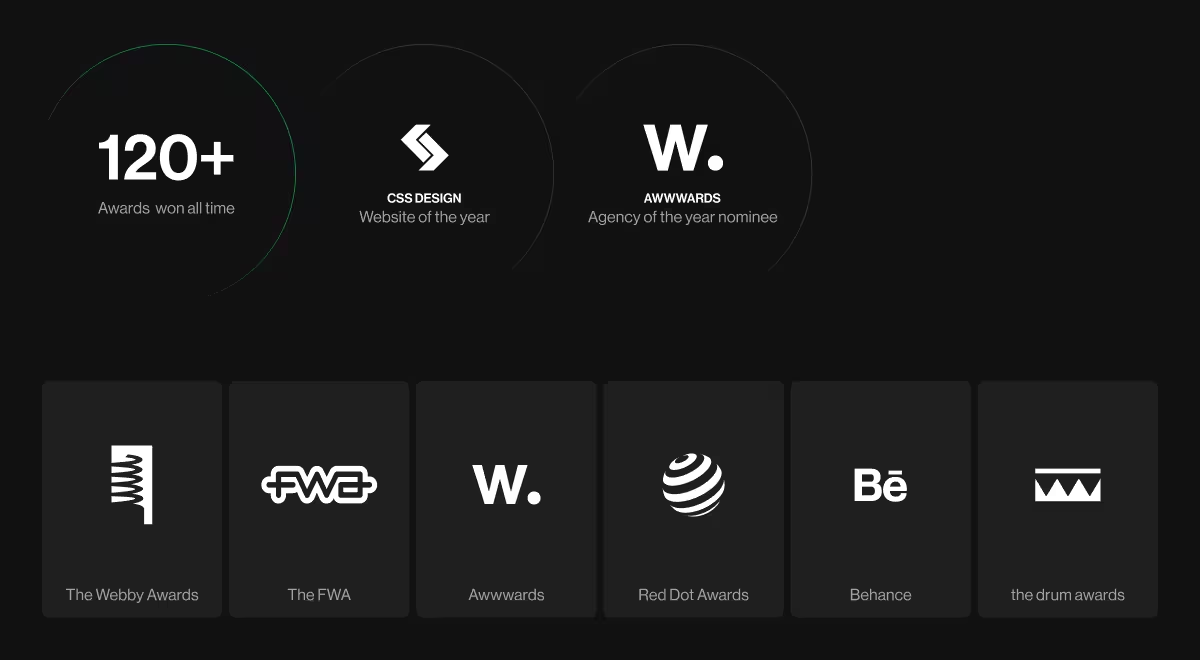
The titles others chase are already engraved with Lazarev.agency
Design that moves people to act
Win trust and drive donations
We create well-designed websites that connect emotionally and convert efficiently. Every form, image, and call-to-action is optimized for engagement and secure payment gateways.
Accessibility for all
We design inclusive, search engine optimized experiences that meet Web Content Accessibility Guidelines, ensuring everyone can engage with your mission — on any device.
Data-driven performance
Our digital agency treats nonprofits like modern organizations using analytics and A/B testing to grow visibility and donations.
Easy management and growth
Built in Webflow, your nonprofit website is simple to update without a developer. Our dedicated support team provides ongoing maintenance and guidance after launch.
What we help nonprofit clients achieve
- More donations — frictionless, mobile-first giving experiences that increase conversion rates.
- Greater visibility — optimized web design and digital marketing for higher search engine rankings.
- Stronger engagement — interactive storytelling and content that keeps visitors involved.
- Community growth — sites that turn one-time visitors into loyal supporters.
Testimonials from those who chose us
Our clients came to us for transformation. See how they describe the difference we made.
“Lazarev. fostered a positive engagement by delivering a navigable site that allowed users to absorb information quickly. The team led a thoughtful, efficient workflow that was always prepared for meetings.”
{{Boyd Hobbs}}
“Through a detailed understanding of the client’s platform, Lazarev. was able to create a clean and intuitive UI/UX design that ticked all the boxes. The team was receptive to all requirements and requests and adapted well to timeline changes. They produced accurate mockups at every iterative stage.”
{{Tommy Duek}}
Our nonprofit web design process
1. Research & strategy
We begin with audience research and competitor analysis to align the website project with your mission and organization’s goals.
2. Information architecture
Our team creates a clear site structure that guides users from curiosity to contribution with ease.
3. Visual design & brand identity
We craft visuals that elevate your nonprofit branding combining authenticity with modern UX to inspire trust and recognition.
4. Development & launch
We handle website development through Webflow, ensuring fast performance, accessibility, and optimization.
5. Ongoing support & growth
Post-launch, we offer maintenance services, keyword research, and digital marketing to help your site scale as your impact grows.
Why nonprofits choose Lazarev.agency
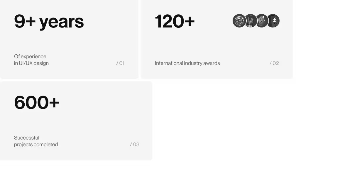
With over a decade of experience and 600+ design projects, we’ve helped NGOs, charities, and mission-driven organizations worldwide increase visibility, engagement, and donations.
We’re not just a web design company. We’re your nonprofit branding agency and strategic partner. From content creation to website redesign, our experienced team delivers custom design services that align your web presence with your mission and help you define success on your own terms.




.webp)


