Our Decade of Designing Experience-Centered Travel and Event Platforms

If you're a business in travel/event looking to:

Boost ticket sales through user-friendly booking systems.

Increase customer satisfaction with tailored event designs.

Reduce abandonment rates with seamless mobile experiences.

Lazarev+Travel will elevate your travel and event business with user-first design solutions.

Check the success stories of our clients below.

book strategy call
/ 01
$500M+
In funding secured 

for our clients
/ 02
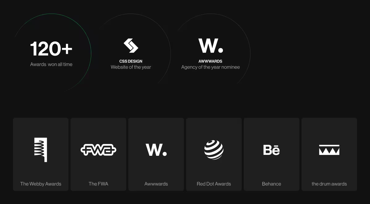
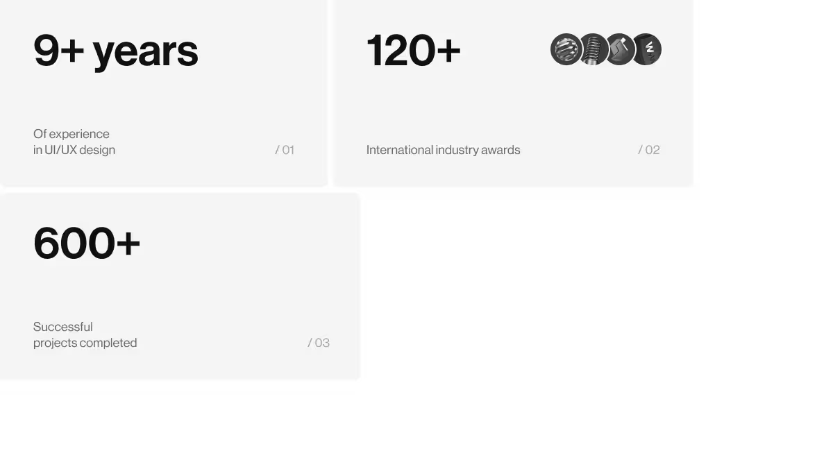
120+
Awards backing 

our excellence
/ 03
We Are
Recognised
By: Forbes, Yahoo, 

Fast company, .INC

Mappn

Mappn provides a real-time application that displays the crowd levels of bars and clubs, aiming to revolutionize the nightlife experience. Unlike traditional platforms like Google, Mappn focuses on precise data and user engagement, enabling users to share their experiences through specific feedback parameters rather than simple star ratings. This approach addresses the common issue of uniformity in ratings, which often complicates users' choices.

View
case study

Key insights into design solutions:

#1

A visually engaging design that utilizes vibrant colors and dynamic elements attract users and create an inviting atmosphere.

#2

The use of chips for user reviews allows for more nuanced feedback on specific attributes of venues, leading to richer data that enhances the decision-making process.

#3

A clean and intuitive interface improves usability, allowing users to quickly access essential information while minimizing cognitive load.

Swipe left to view more
Results:
Interactive map collects data about amount of visitors at places live and visualizes suggestions based on user's preferences. Mappn is a night-out app so it tracks three types of places: clubs, pubs and bars.
JS Text
Additionally to business of the place, app collects visitor's feedback and creates a detailed place profile with tags, best hours to visit and recommendations.
JS Text
Once users are ready to attend the picked place, the app helps with directions integrating Google Maps, Waze, Uber or Lyft and sharing locations with friends via web-client.
JS Text
Upon visiting, app adds user's feedback the place profile. The app tracks when users leave the location and gently reminds to leave review.
JS Text
We made sure the app has extensive functionality to cover user preferences and corner cases.
JS Text
Memorable brand identity for Mappn app.
JS Text

AI Infra Summit

The AI Infra Summit is the premier event for data scientists, machine learning engineers, and technology leaders who are driving the future of AI. Hosted by AI Infrastructure, this one-day conference brings together experts from across the industry to share insights, best practices, and emerging trends in the field of machine learning infrastructure. From architecture and scalability to security and governance, the Summit offers an opportunity for attendees to stay at the forefront of AI development and unlock new opportunities for innovation.

View
case study

Key insights into design solutions:

#1

The AI Infra Summit offers a unique opportunity to connect with and learn from leading experts in the field, gaining valuable insights into the latest trends, challenges, and opportunities in AI infrastructure. Demonstration of possibilities with the help of different key messages for interest and satisfaction of answers

#2

Brightness, dynamism and volume demonstrate the uniqueness of the summit, attract attention and highlight the event in a busy environment of information and advertising.

#3

Development of a visual style and its support at all stages from digital to print materials, allowed to create a holistic line of brand perception and immerse into the space AI Infra Summit

Swipe left to view more
Results:
700+
People visited the summit
The starting screen of the site, a large message and basic information about the summit, a linear simple structure allows you to consistently read the information. The main line does not shift throughout the site
JS Text
Dynamic presentation of industries and topics that will be at the summit
JS Text
List of speakers, in addition to the photo, the emphasis is shifted to the company that the speaker represents
JS Text
Summit schedule and topics
JS Text
Visual materials of the summit
JS Text
Other Screens
JS Text

FCF

FCF serves as a comprehensive flight comparison platform, functioning similarly to Skyscanner. It aggregates data from numerous airlines and travel agencies, allowing users to effortlessly compare flight options based on price, duration, and other relevant criteria. With a user-friendly interface, FCF simplifies the travel planning process, making it accessible for users of all experience levels.

View
case study

Key insights into design solutions:

#1

A clean and intuitive layout significantly enhances user navigation, reducing cognitive load and making the search process straightforward. Clear categorizations of flight options facilitate quick comparisons and informed decision-making.

#2

Implementing a robust filtering system enables users to refine search results based on personal preferences such as layover times, airline choice, and price range. This feature empowers users to tailor their travel experience, increasing satisfaction.

#3

The inclusion of user reviews and ratings for airlines fosters trust and transparency. By providing access to firsthand experiences, users can make better-informed choices, resulting in improved overall satisfaction.

Swipe left to view more
Results:
JS Text
JS Text
JS Text
JS Text
JS Text
JS Text
JS Text

Swell AI

Swell AI is a premier summit focused on integrating artificial intelligence with user experience design in the picturesque setting of Honolulu, Hawaii. The event gathers thought leaders, innovators, and creators in the AI and UX fields to explore how to make AI not only functional but also enjoyable and intuitive for everyday users. Through a series of keynotes, panels, and networking opportunities, Swell AI aims to foster collaboration and inspire attendees to create user-centered AI solutions that seamlessly integrate into people's lives.

View
case study

Key insights into design solutions:

#1

A clean, uncluttered design ensures that critical information, such as the date, location, and speakers, is presented prominently, enhancing user comprehension.

#2

The use of contrasting fonts and sectioning the content with white space effectively guides users through the page, reducing cognitive load and improving the readability of complex details.

#3

The inclusion of user reviews and ratings for airlines fosters trust and transparency. By providing access to firsthand experiences, users can make better-informed choices, resulting in improved overall satisfaction.

Swipe left to view more
Results:
JS Text
JS Text
JS Text
JS Text

Dirs21

DIRS21 serves as a dedicated partner for hotels, offering innovative solutions for direct bookings and online distribution. The platform's channel management tools enhance reach and streamline operations, ensuring hotels can maximize their online visibility and bookings. By redefining direct bookings, DIRS21 One enhances both design and functionality, providing an intuitive experience that meets the needs of modern hoteliers.

View
case study

Key insights into design solutions:

#1

A clear and concise navigation system allows users to quickly access essential features, significantly improving user satisfaction and reducing bounce rates.

#2

Personalization features that adapt to user behavior and preferences enhance the booking experience, fostering loyalty and encouraging repeat business.

#3

Data-driven insights leveraged to optimize the booking flow, resulting in a reported increase in direct bookings.

Swipe left to view more
Results:
JS Text
JS Text
JS Text
JS Text
JS Text

Blavity Site

Blavity House Party provides an immersive and interactive experience for users who want to stay connected with the latest cultural events and news. Through dynamic event announcements, subscription options, and visual recaps of past festivals, Blavity House Party creates a seamless way for users to engage with both the platform and its community.

View
case study

Key insights into design solutions:

#1

The bold, high-contrast design grabs attention and reflects the lively spirit of Blavity House Party, creating a memorable brand experience.

#2

Bold typography is utilized to convey important information clearly and effectively. The combination of large headlines and concise text promotes readability and ensures that key messages are immediately recognizable.

#3

Visual hierarchy directs users’ attention to essential information and actions, ensuring that key elements stand out and guiding user behavior effectively.

Swipe left to view more
Results:
A one pager for a 4-day festival hosted by Blavity — a community of People of Color in Tech and more.
JS Text
HomeWebsite features festival lineup, multiple options of tickets, timetable and access to exclusive merch.
JS Text
Website features festival lineup, multiple options of tickets, timetable and access to exclusive merch.
JS Text
Website features festival lineup, multiple options of tickets, timetable and access to exclusive merch.
JS Text
We included integration with Blavity News — another project of Blavity — to create cross-traffic.
JS Text

UA Travel

UA Travel presents a comprehensive collection of travel guides and curated experiences throughout Ukraine. The platform features various thematic collections, highlighting the best waterfalls, winter hiking adventures, and scenic routes, enabling travelers to discover hidden gems and iconic destinations alike. Each collection is thoughtfully crafted to provide essential insights and tips, ensuring users can make the most of their journeys while exploring the breathtaking landscapes of Ukraine.

View
case study

Key insights into design solutions:

#1

The interface is designed with user preferences in mind, allowing easy navigation through curated collections. This approach significantly improves user satisfaction and time spent on the site.

#2

High-quality images and engaging visuals of destinations create an inviting atmosphere, effectively capturing users' attention and encouraging exploration of the content.

#3

Corporation of interactive maps and dynamic filters allows users to personalize their travel experiences. This feature enables users to tailor their search based on specific interests, increasing the likelihood of engagement and conversions.

Swipe left to view more
Results:
JS Text
JS Text
JS Text
JS Text

Lviv.travel

Lviv.travel serves as a comprehensive guide for travelers seeking to explore the vibrant city of Lviv, Ukraine. The platform features a well-organized layout, offering users access to essential travel information, local attractions, events, and cultural insights. With engaging visuals and intuitive navigation, Lviv.travel enhances the user experience by simplifying the process of discovering the best Lviv has to offer.

View
case study

Key insights into design solutions:

#1

A visually appealing design with high-quality images and a consistent color palette contributes to a welcoming atmosphere, inviting users to explore the site further.

#2

Clear navigation with categorized sections (e.g., attractions, food & drink, events) enables users to find information quickly, reducing frustration and enhancing the overall experience.

#3

Swipe left to view more
Results:
JS Text
JS Text
JS Text
JS Text
JS Text
JS Text

#1

#2

#3

Swipe left to view more
Results:

#1

#2

#3

Swipe left to view more
Results:

Hit me up! Let’s chat about your growth

Kirill Lazarev
Founder of Lazarev.
Let’s talk
00 FPS