How we helped a charity foundation streamline donations and expand support during Ukraine’s critical times
Project:
the project
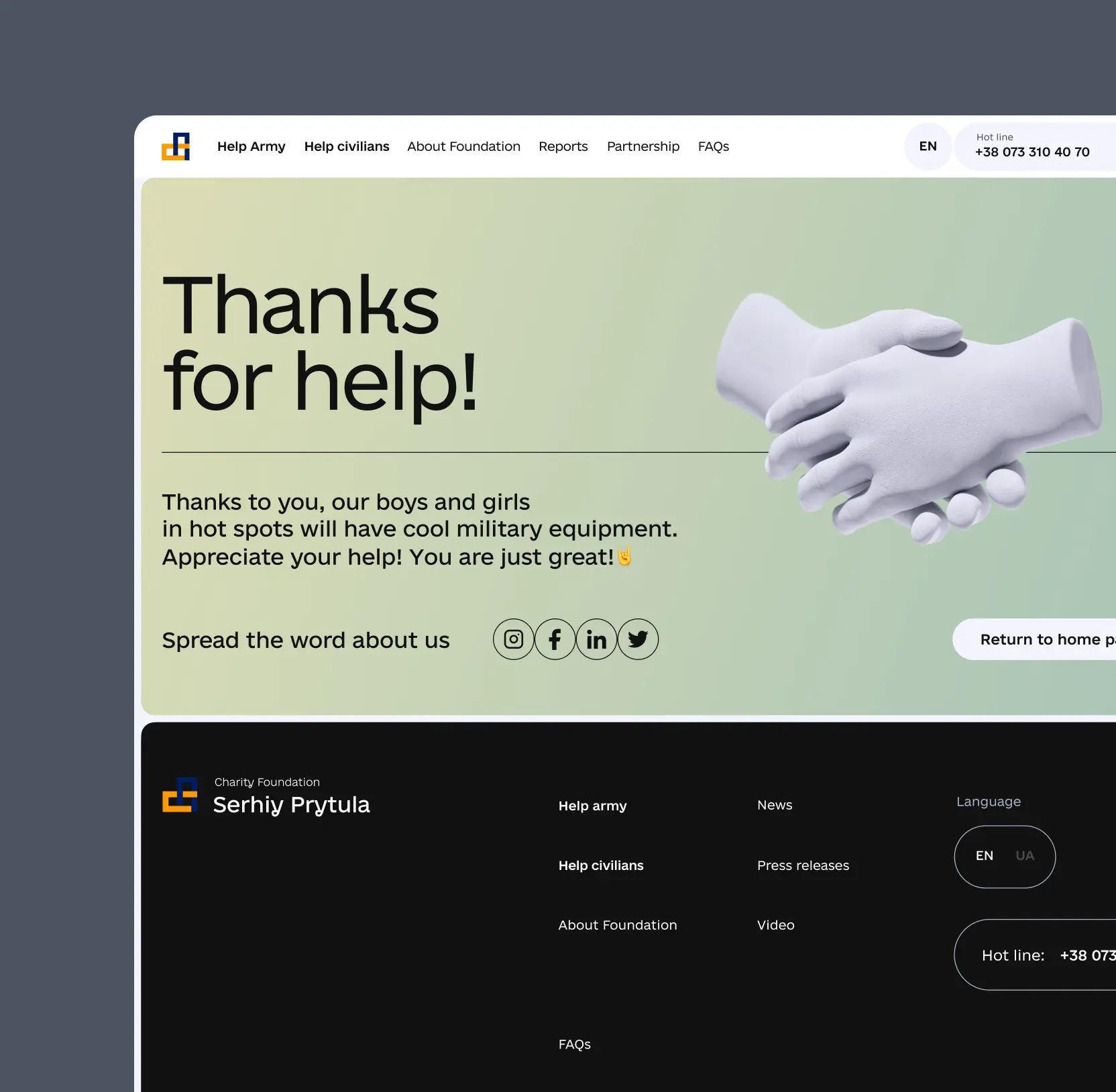
As the full-scale war unfolded in Ukraine, the demand for donations and military support surged to unprecedented levels. The Prytula Foundation, being the primary provider of military aid, faced mounting challenges in managing this influx of requests. Their existing website, which once served effectively, no longer aligned with the new demands and complexities brought on by the crisis. It became clear that a modern, accessible digital platform was essential to facilitate aid, increase transparency, and encourage support from both within Ukraine and globally.
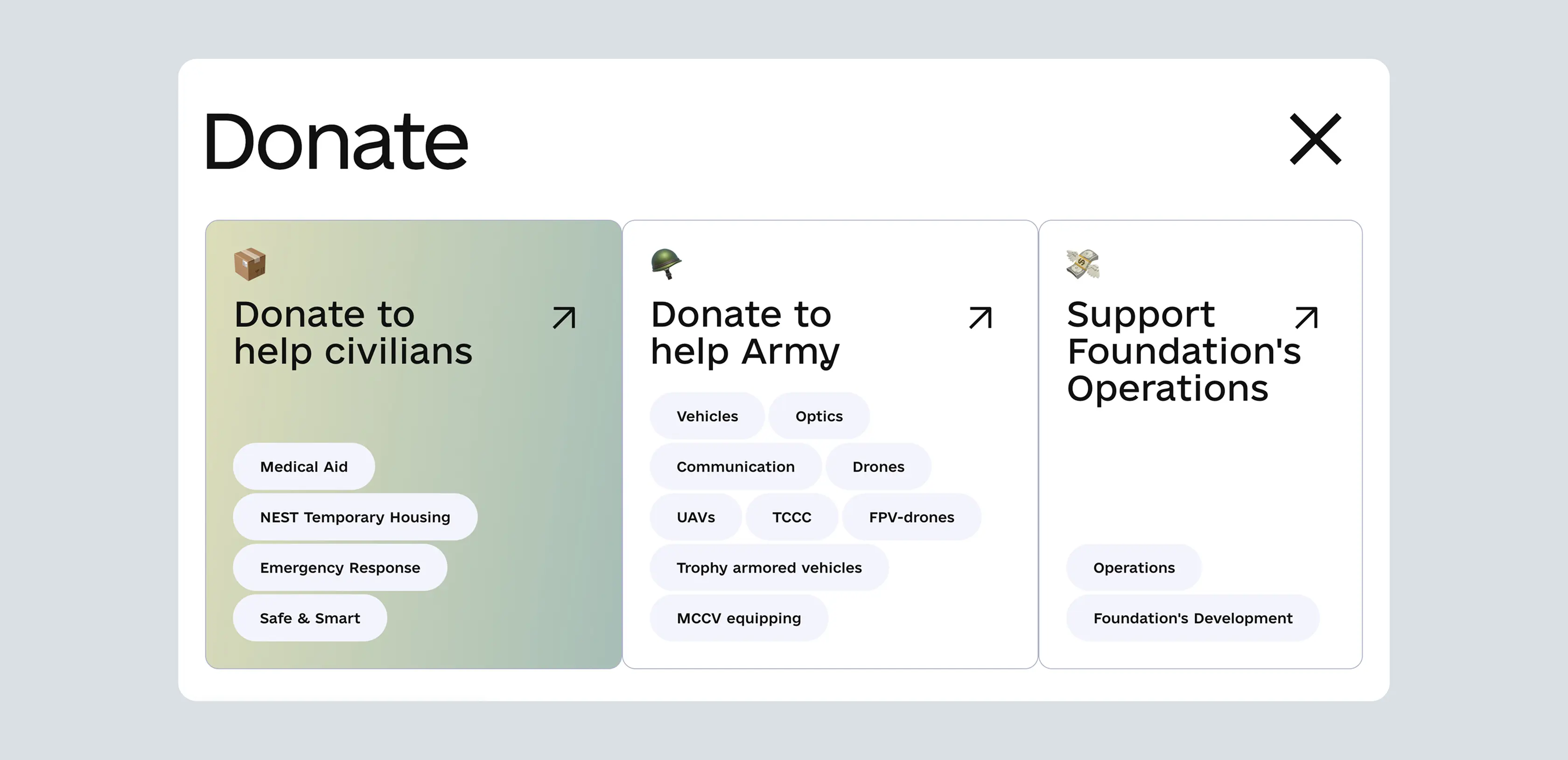
The approach centered on simplifying the donation process, making it as effortless and intuitive as possible for users to contribute or seek assistance. We aimed to create a unified online hub where people could easily access detailed information about the Foundation's work, whether they wanted to support frontline military units or local medical centers. The goal was to reduce barriers to giving and receiving aid, turning complex procedures into just a few clicks.
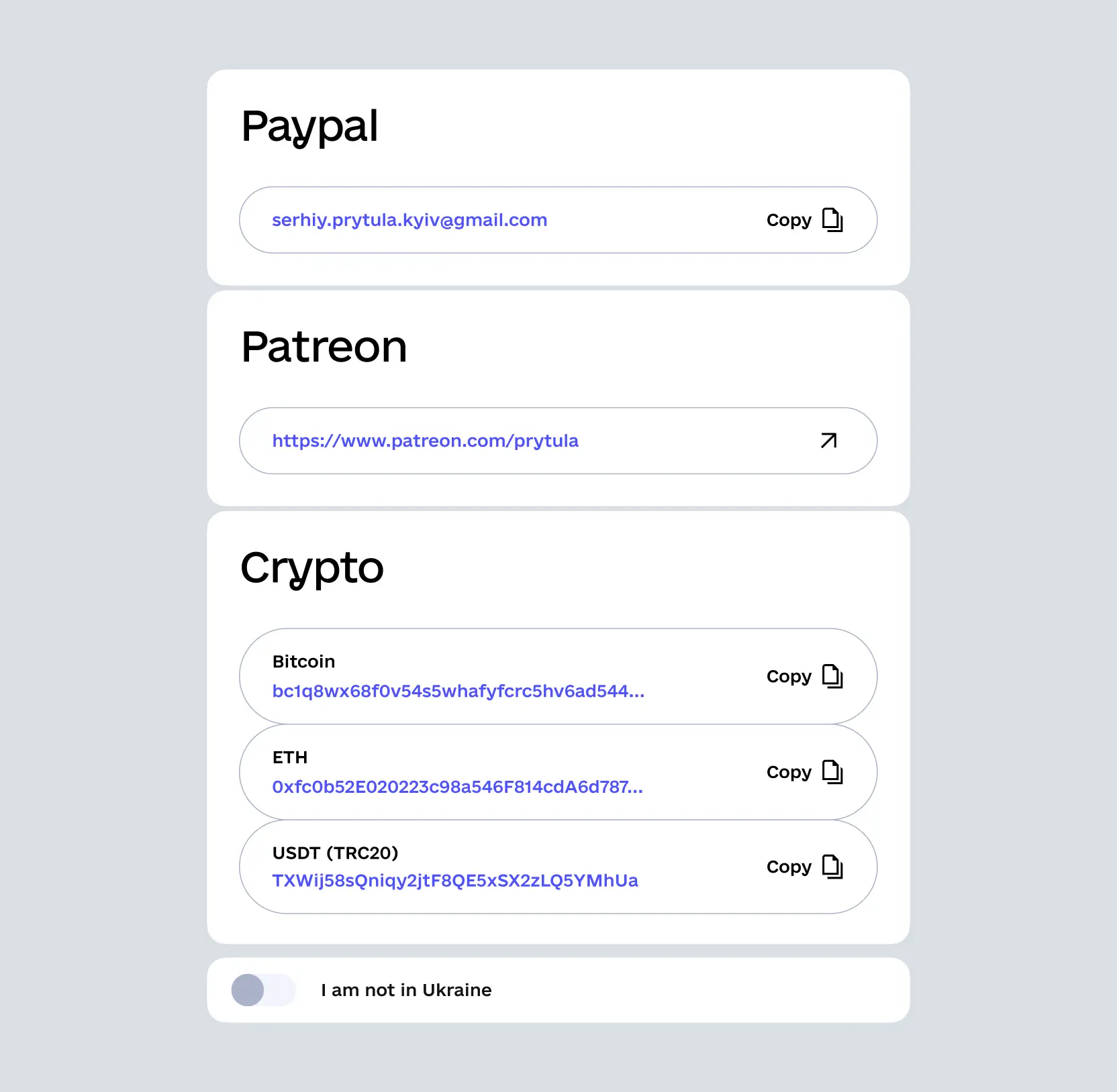
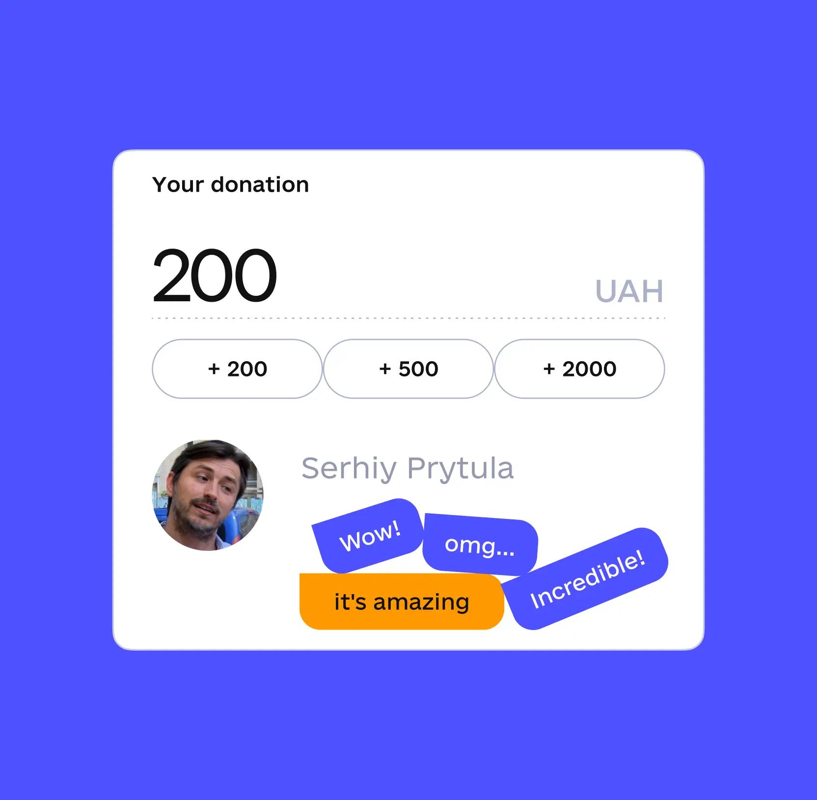
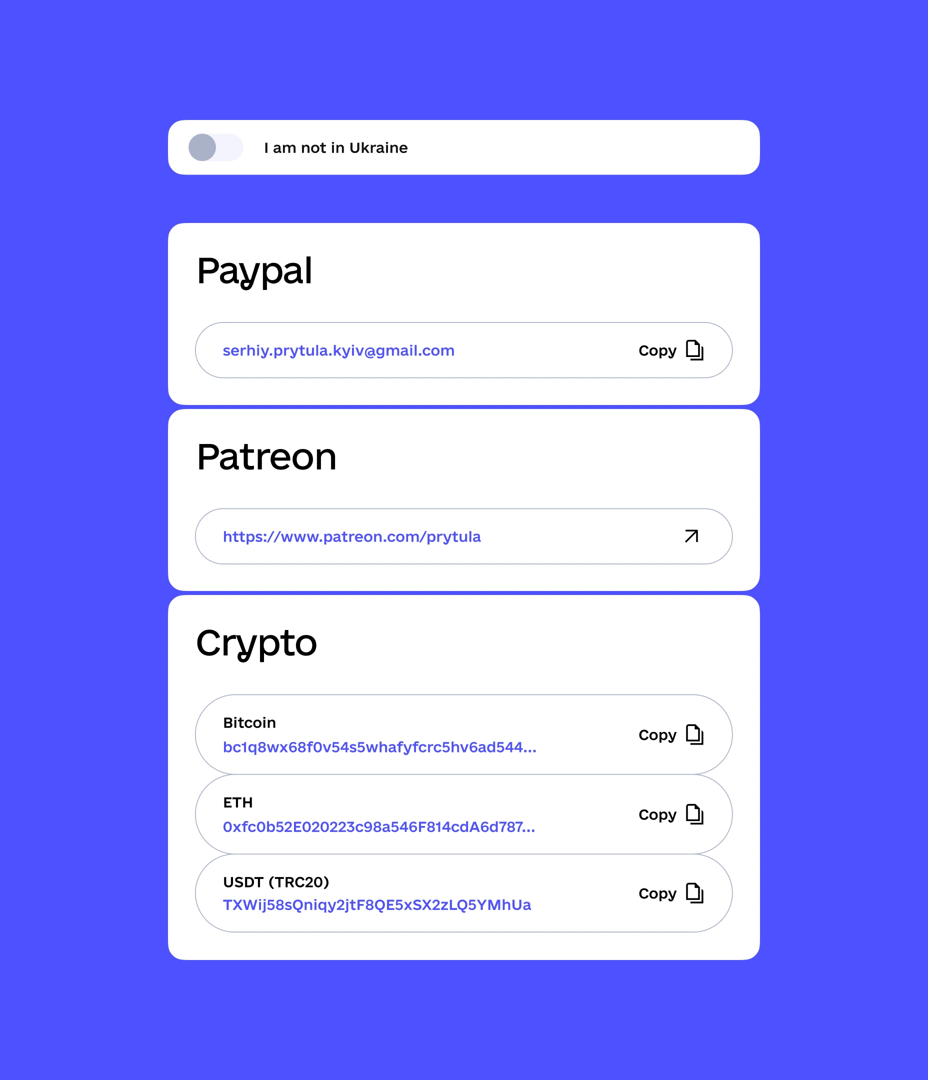
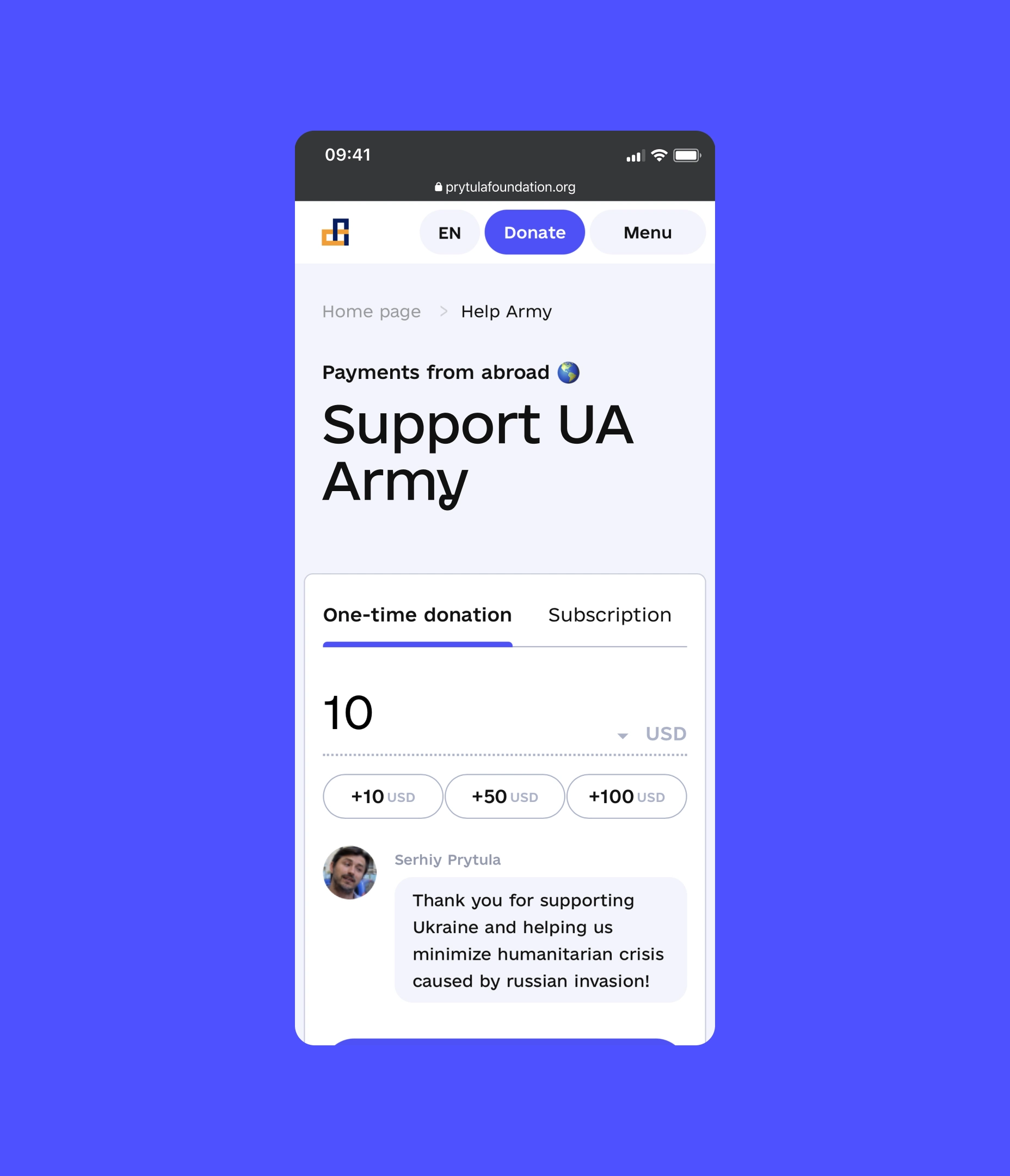
The new donation process, featuring an innovative toggle that automatically adjusted bank details based on the donor’s location, helped double charitable contributions shortly after launch. Additionally, an interactive donation widget, where every contribution was accompanied by heartfelt phrases from the Foundation’s founder, Serhiy Prytula, encouraged larger donations.
By prioritizing accessibility and simplicity, we reduced the drop-off rate noticeably.
The improved donation process led to charitable contributions doubling soon after.
The interactive donations widget significantly increased the average contribution.
The Project’s
Discovery Phase
Crafted an engaging and impact-oriented homepage to capture support immediately
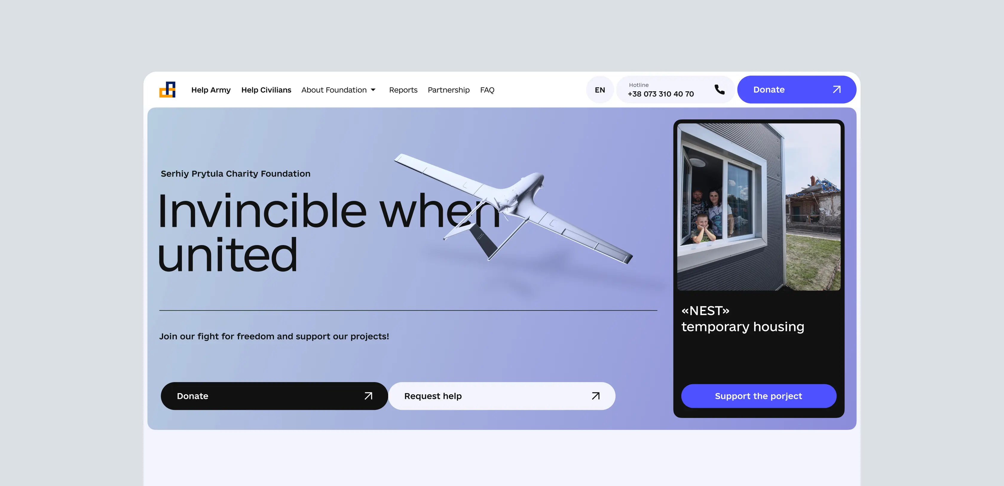
Our team redesigned the Foundation’s homepage to serve as a compelling gateway that instantly communicates its mission and impact. Featuring an interactive 3D model of a donated drone, prominent call-to-action buttons for donations and aid applications, and a showcase of ongoing projects, the new homepage effectively captures visitor attention and encourages immediate engagement. This strategic visual and content hierarchy ensures that supporters understand the urgency and scope of the Foundation’s work from the moment they land on the site.
The complete website redesign guide: strategy & launch
Optimized the mobile donation experience to maximize accessibility and convenience
We optimized the donation page for speed, responsiveness, and ease of use across all devices. The new version features simplified navigation, quick access to payment options, and a straightforward interface that allows supporters to contribute effortlessly, even in areas with limited internet connectivity. This ensures that donors can support the Foundation anytime and anywhere, significantly expanding its reach.
Redesigned the partnership page to encourage corporate and individual collaborations
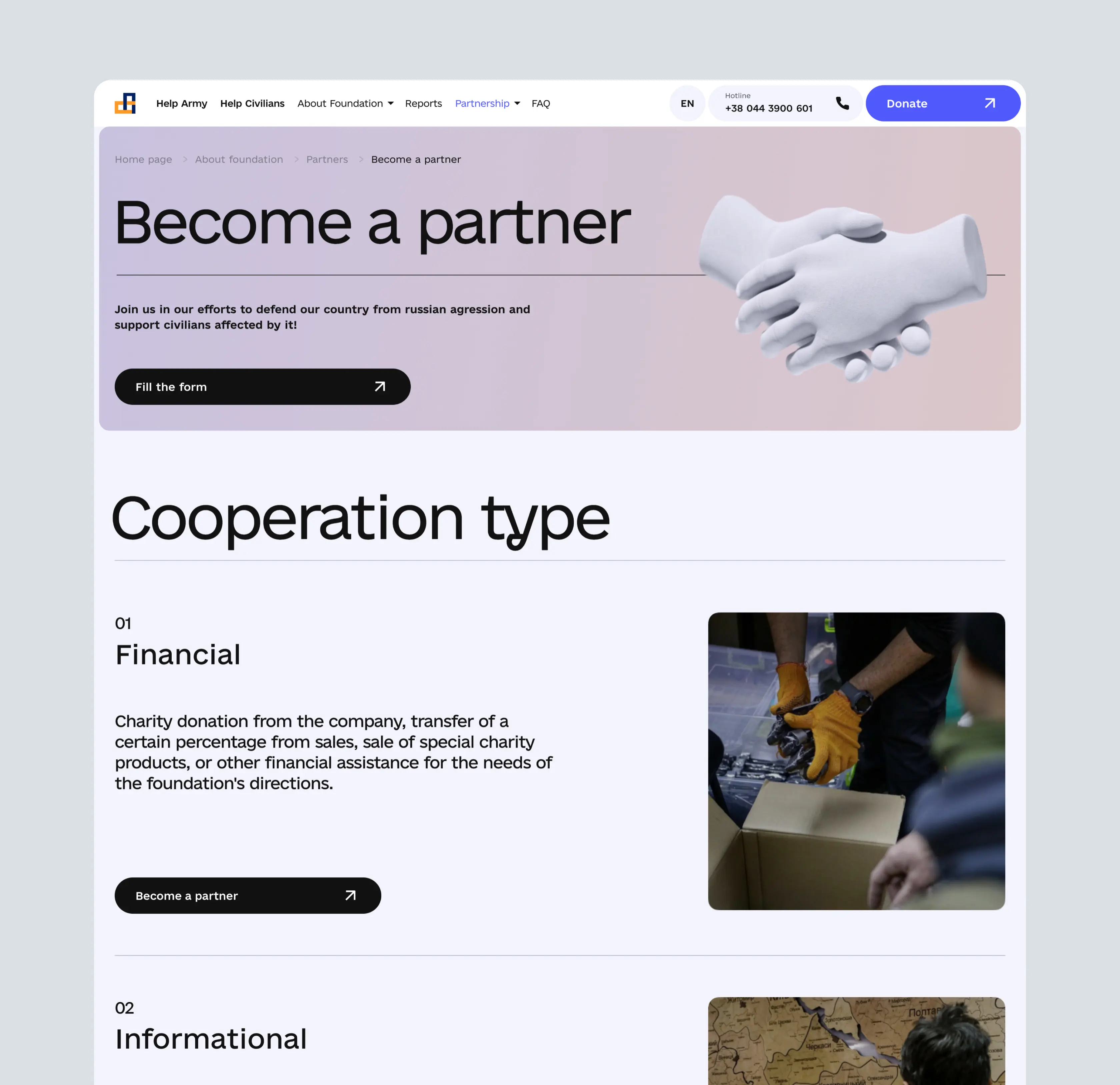
To foster new partnerships, we refreshed the Partnership webpage with a clean, informative layout that clearly outlines collaboration opportunities, partnership types, and the steps to get involved. The new design makes it easy for businesses and individuals to find relevant information, access necessary materials, and initiate partnerships, thereby expanding the Foundation’s network of support and resources.
Charity organization boosts donations by 50% in one month with Lazarev.agency’s redesign
Created an interactive donation widget to significantly increase contributions
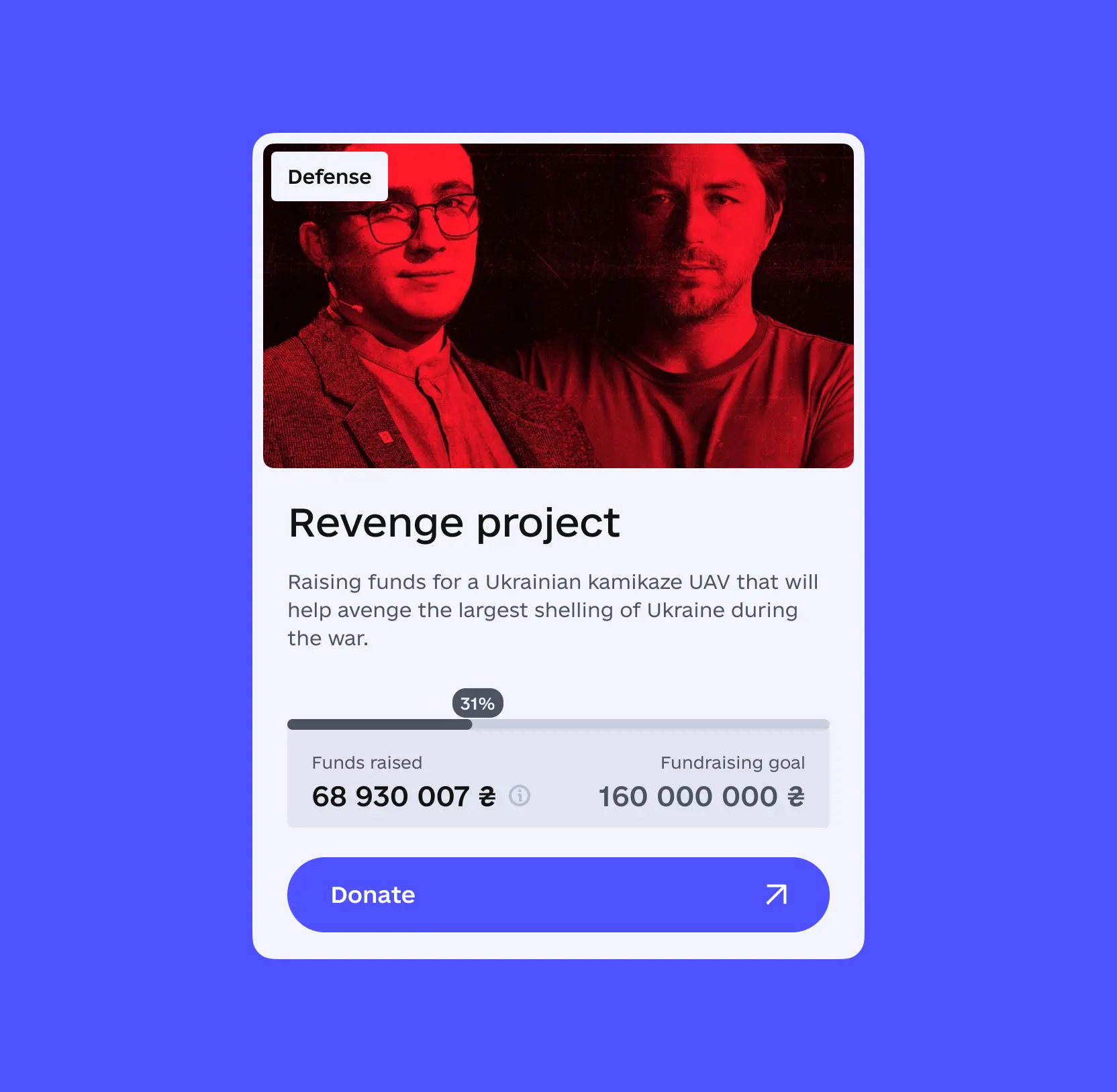
Recognizing the power of emotional connection, we integrated an interactive widget that displays personalized, motivational phrases from the Foundation’s founder, Serhiy Prytula, whenever a supporter enters a donation amount. This engaging feature not only personalizes the donation experience but also encourages larger contributions. As a result, the average donation amount increased by nearly 25%, directly boosting the Foundation’s fundraising potential.
Emotional website design: how to build digital products that users feel
AI & ML
Lazarev. agency offers comprehensive digital design services. Discover our range of related expertise supported by impactful case studies.
More Scaleups Cases
FAQ
What are effective strategies to increase donations for charities during times of crisis?
Implementing a simplified, intuitive donation process with features like location-based bank details and multi-currency support can significantly boost contributions. In our case, introducing an innovative toggle that automatically adjusted bank details based on donor location doubled charitable donations shortly after launch.
How can charities improve transparency and build trust with supporters?
Creating a comprehensive knowledge base that provides detailed information about operations, projects, and impact reports enhances transparency. Regular updates through news sections and media releases foster credibility and ongoing engagement.
What solutions can help charities make online giving more accessible across devices?
Optimizing the donation experience for mobile devices through speed, responsiveness, and simple navigation ensures supporters can contribute effortlessly from any location. This approach maximizes accessibility and broadens the donor base.
How can interactive features increase donor engagement and donation sizes?
Incorporating interactive elements like personalized motivational messages from founders or beneficiaries encourages emotional connection. For example, an interactive donation widget with heartfelt phrases increased the average donation amount by nearly 25%.
What are best practices for creating a compelling homepage for a charity during a crisis?
Designing a homepage that immediately communicates the mission and impact such as showcasing ongoing projects, using engaging visuals like 3D models, and prominent call-to-action buttons captures visitor attention and drives immediate support.
How can charities foster partnerships with corporations and individuals?
Developing a clear, informative partnership page that outlines collaboration opportunities, steps to get involved, and easy access to materials encourages new collaborations and expands support networks.
What are the benefits of integrating multi-platform and multi-currency donation systems?
Supporting multiple currencies (USD, EUR, UAH) and integrating various payment methods (PayPal, Patreon, cryptocurrencies) simplifies international donations, broadens global reach, and removes barriers to giving, significantly increasing support from diverse regions.


