How EdTech platform design created an intuitive and engaging learning experience
Project:
the project
Challenge:
The Teachchain team aimed to launch a groundbreaking EdTech solution, but lacked a clear vision for platform functionality and had no defined brand identity. They turned to Lazarev.agency to apply EdTech platform design principles, creating a purposeful user experience that prioritizes user acquisition and positions the startup for growth in a competitive market.
Approach:
We applied a full-scale EdTech platform design approach, beginning with in-depth UX research and extending through to final delivery. The team defined a clear product roadmap, crafted tailored experiences for three distinct user personas, and ensured that navigating the platform’s diverse features was intuitive, seamless, and optimized for user adoption.
The Project’s
Discovery Phase
Experience strategy
Our vision was clear: transform mundane learning into an exciting journey filled with rewards for everyone - students, educators, and contributors alike. We aimed to unveil a new facet of education, captivating young audiences and inspiring them to participate in the growth, sharing, and advancement of global IT education.
To achieve this, we integrated a variety of gamification elements, interactions, and a vibrant brand identity that invoked positive emotions and conveyed the promise of a brighter future.
Prioritizing the needs of contributors
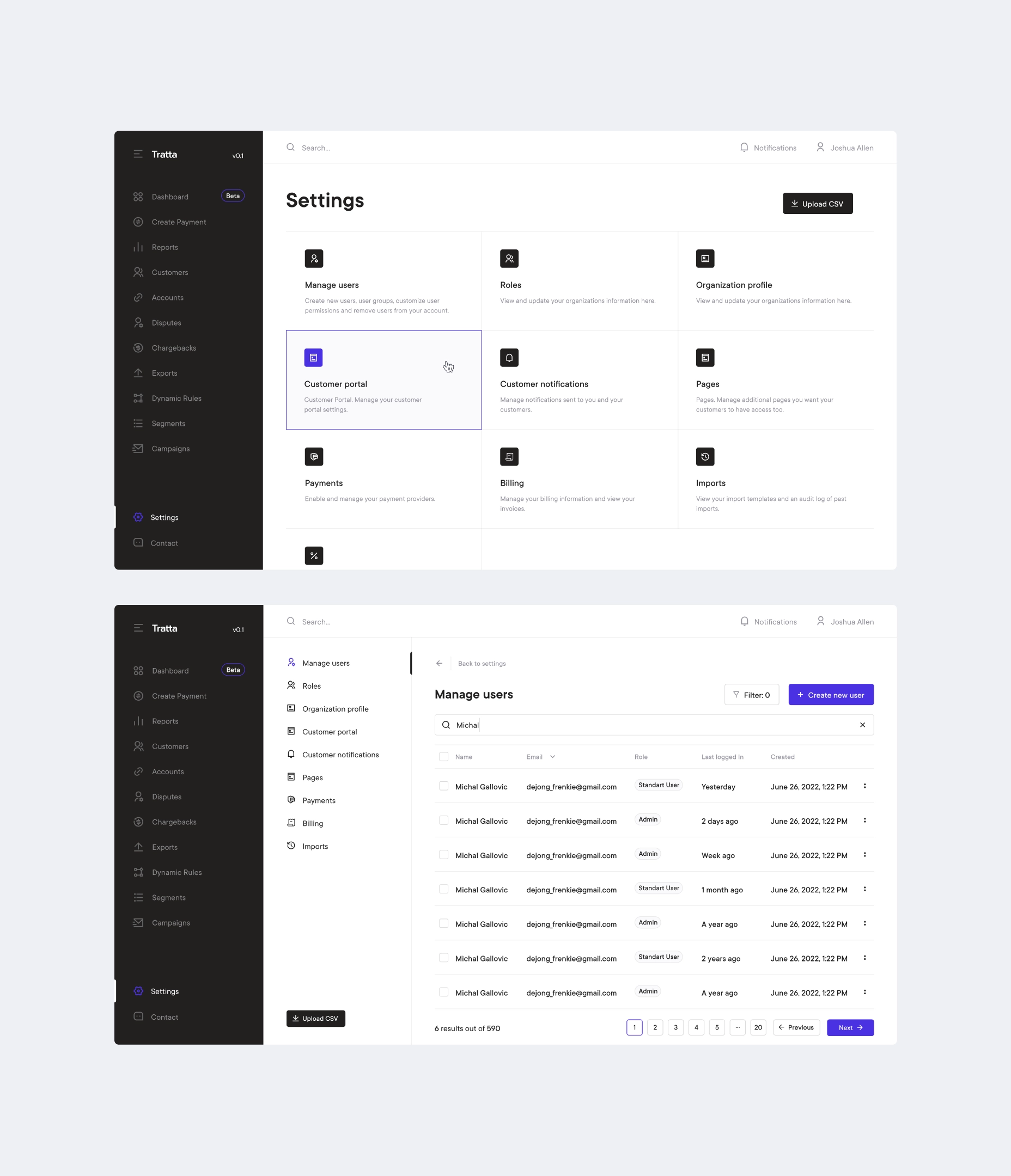
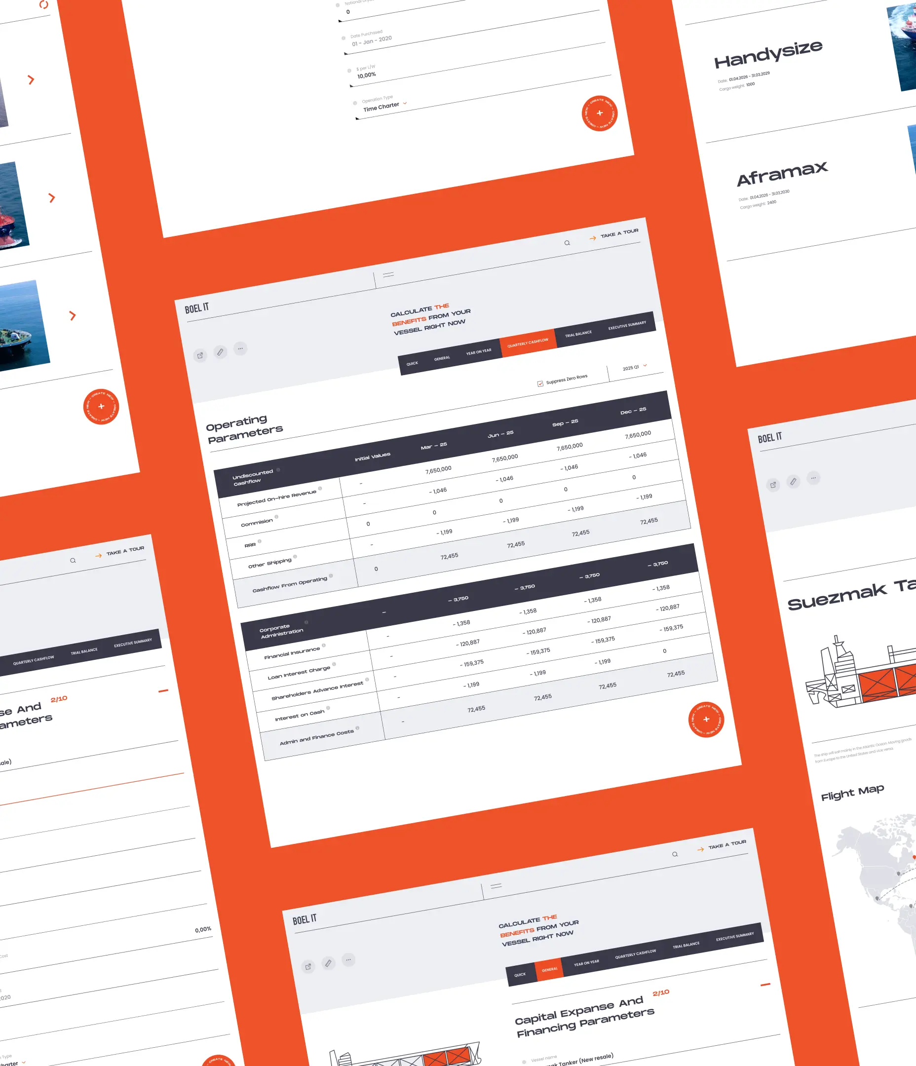
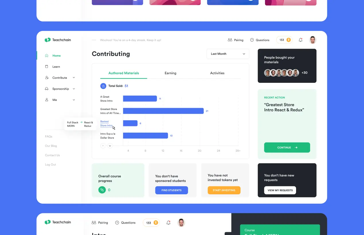
With a platform structured around contributors, students, and sponsors, we initiated our focus on contributors. This stems from the pivotal need to attract those who generate learning materials for students, priming the learning journey. The contributor homepage showcases buyers, authored materials, sales volumes, and platform-wide earnings statistics.
Creating a quiz and learning materials
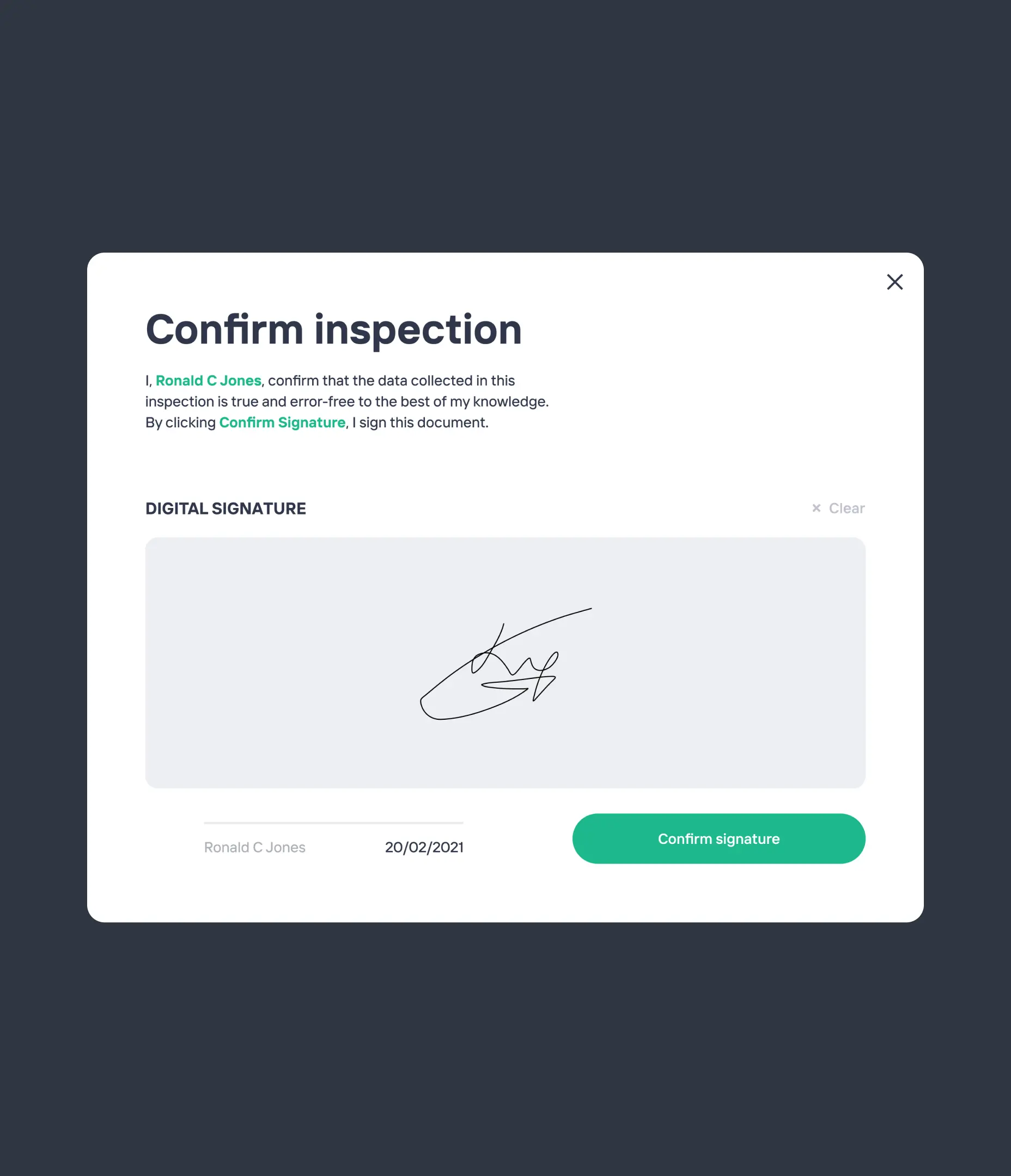
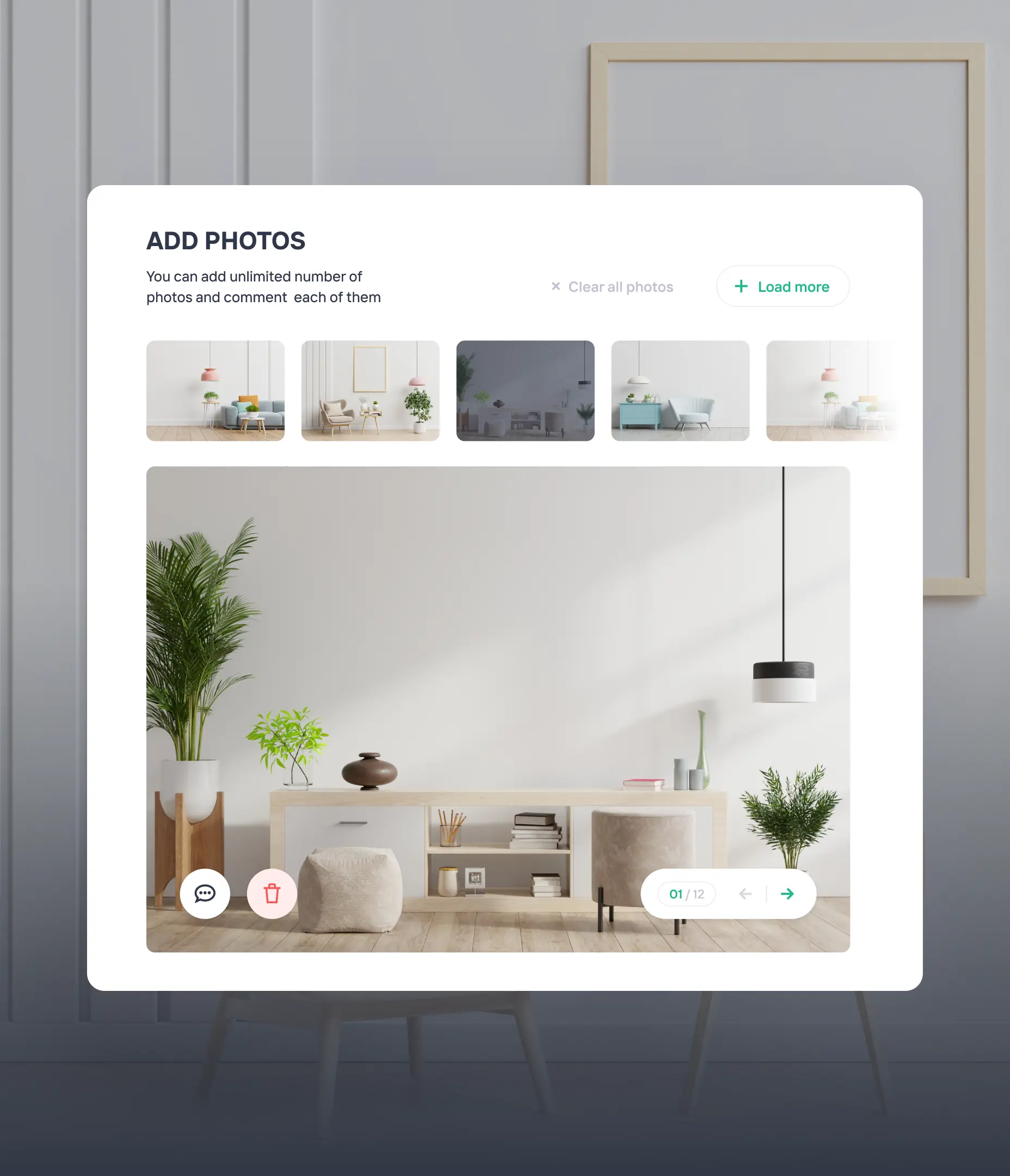
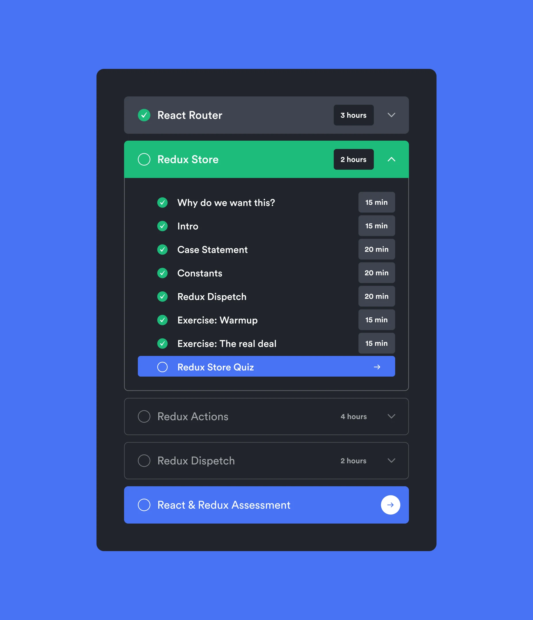
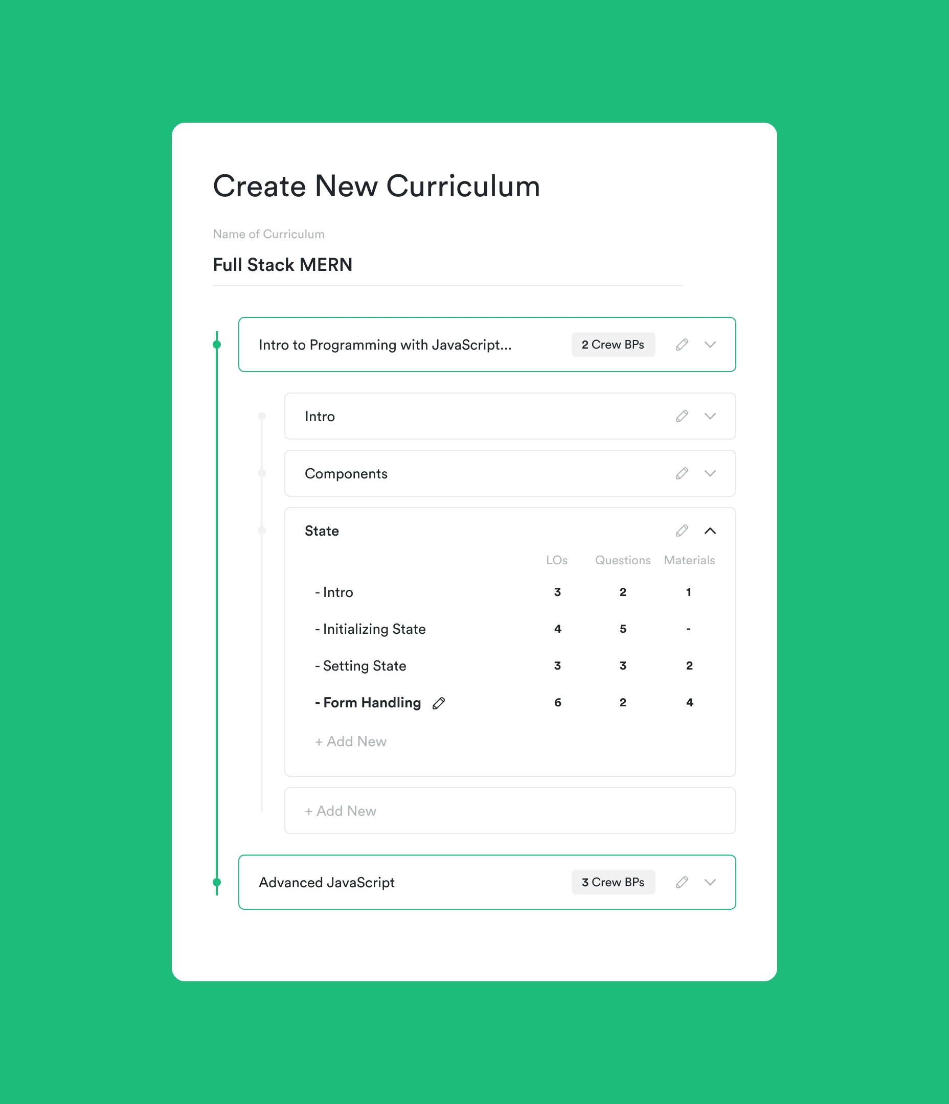
We've developed a straightforward process for contributors to showcase their expertise before crafting content on a particular topic. Once passed successfully, they can enrich their material with videos, images, and code in the “Contribute” section. Every contribution is saved automatically and subjected to a review by admins.
Enhancing student engagement
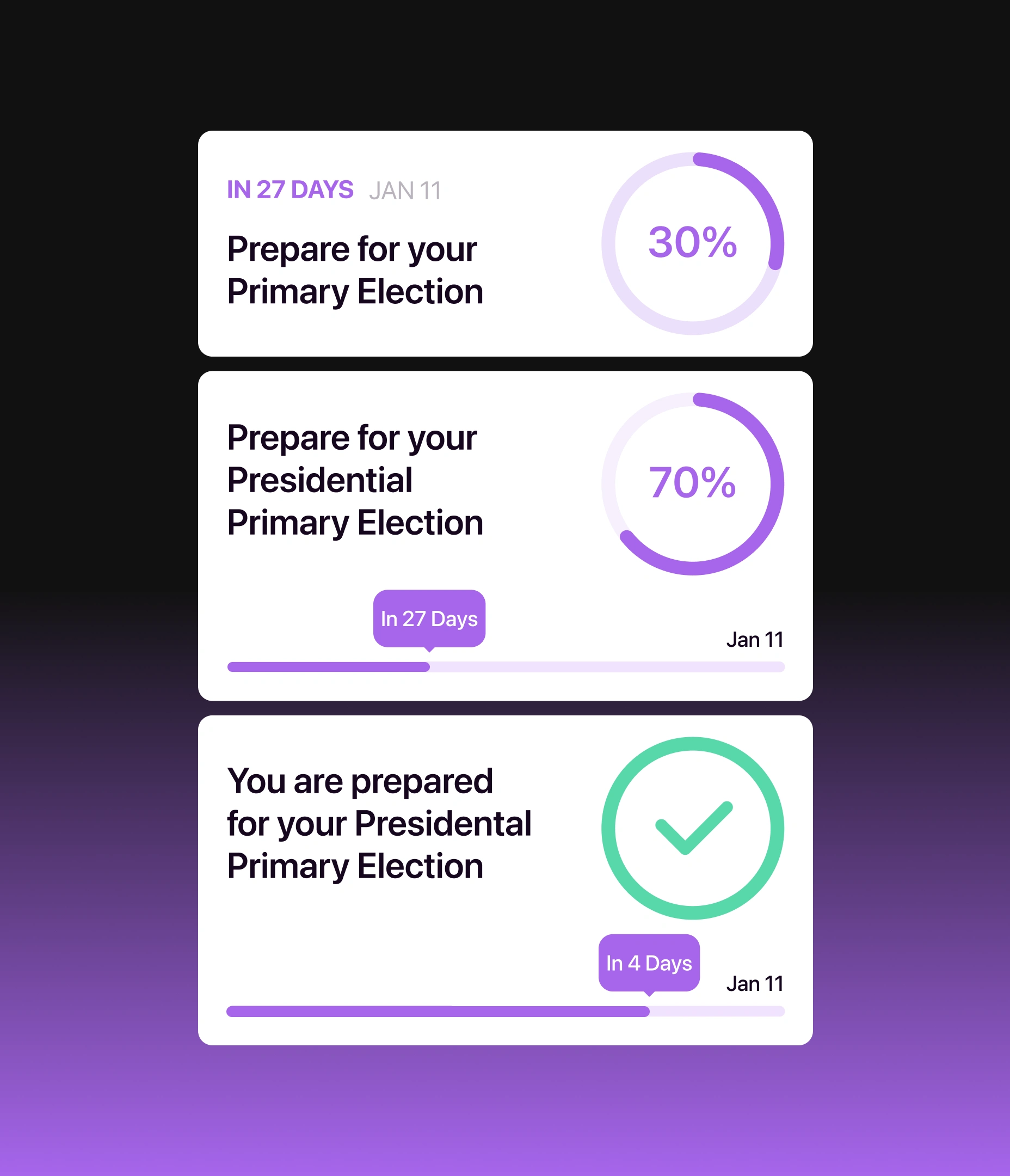
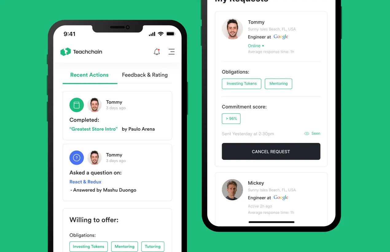
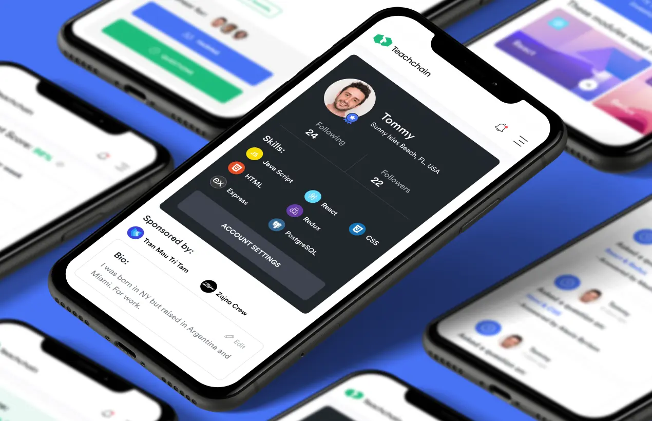
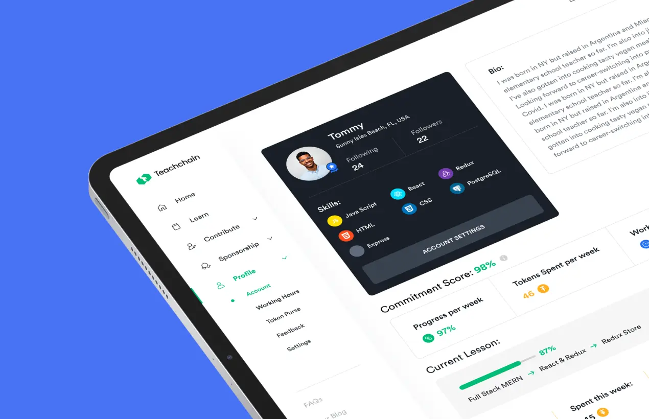
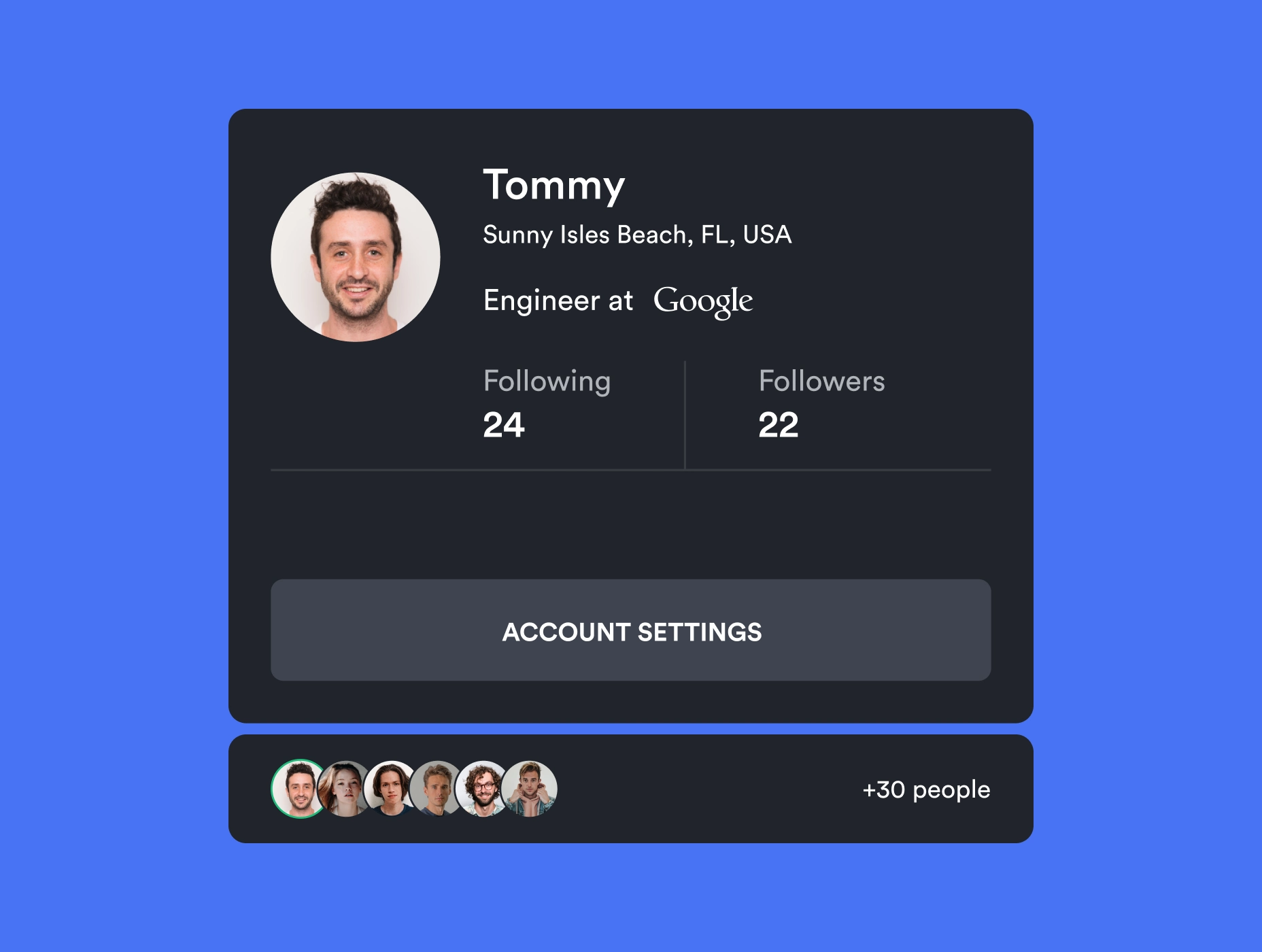
The student profile includes various features that display learning progress through a progress bar indicating module completion and overall learning time. Within the profile, students have the option to share their bio, view followers, see those they follow, identify sponsors, showcase skills and stats, and track token usage. We intentionally incorporate gamification elements to enhance student engagement and elevate the allure of their learning journey.
Visualising data on the sponsors’ dashboard
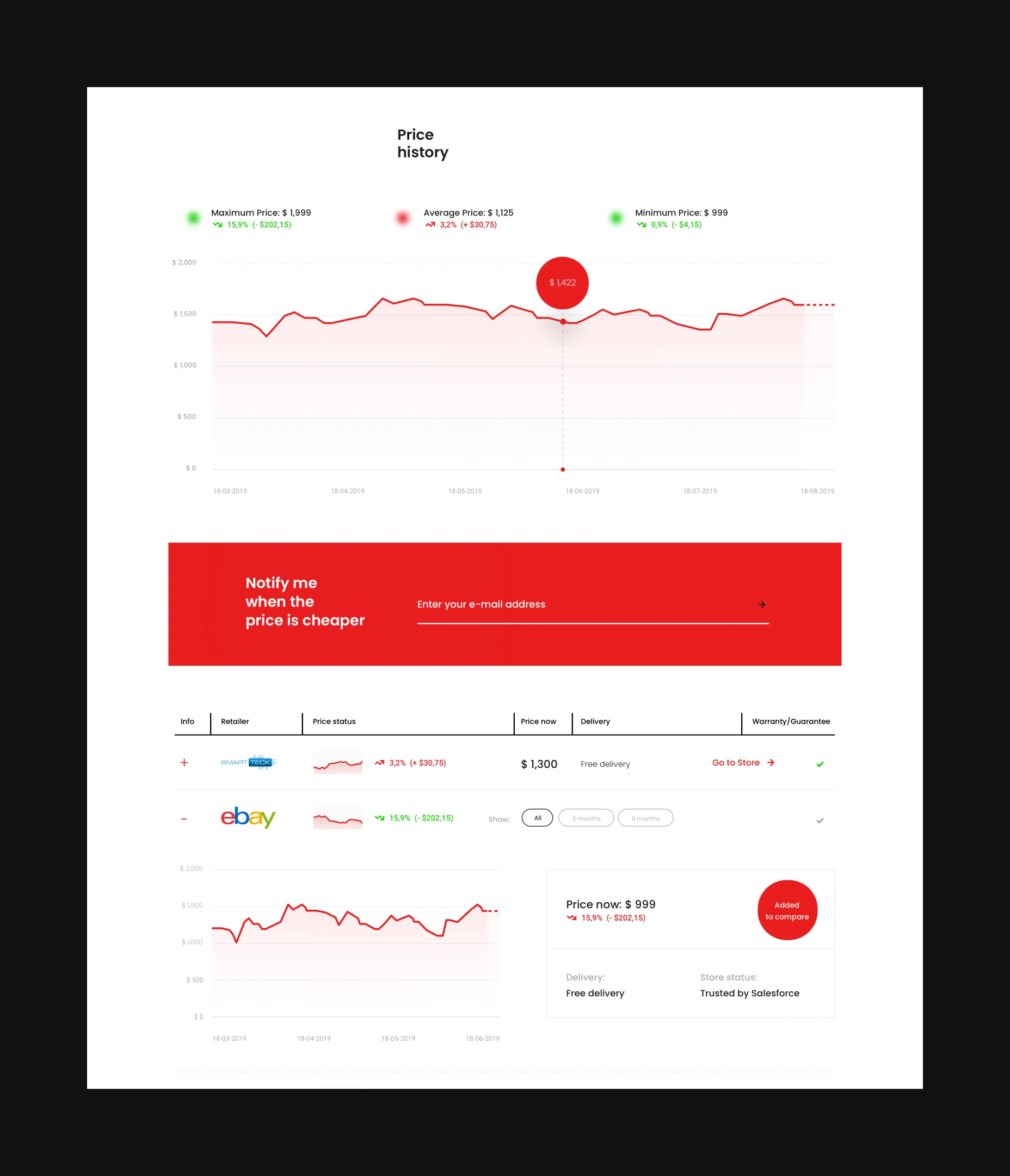
As the platform mainly offers paid materials, students require funds for learning. To support them, we introduced the sponsorship feature. Students have dedicated pages to connect with sponsors, while sponsors can track their impact through stats like investment, students supported, sponsorship requests, and more. We've also enabled students to showcase job-seeking progress, ensuring sponsors are informed about their investment's return.
Advocating the brand's presence across all digital
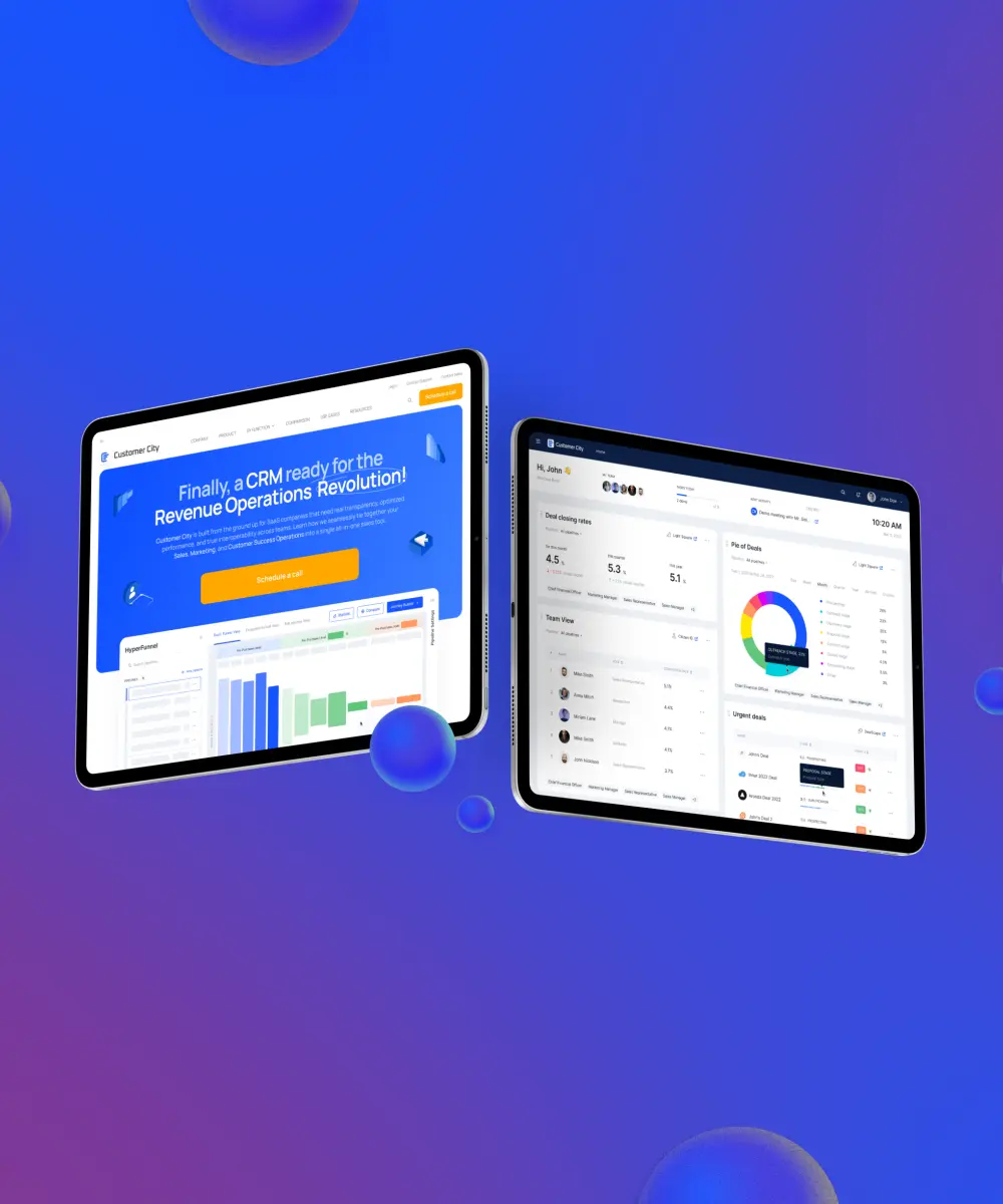
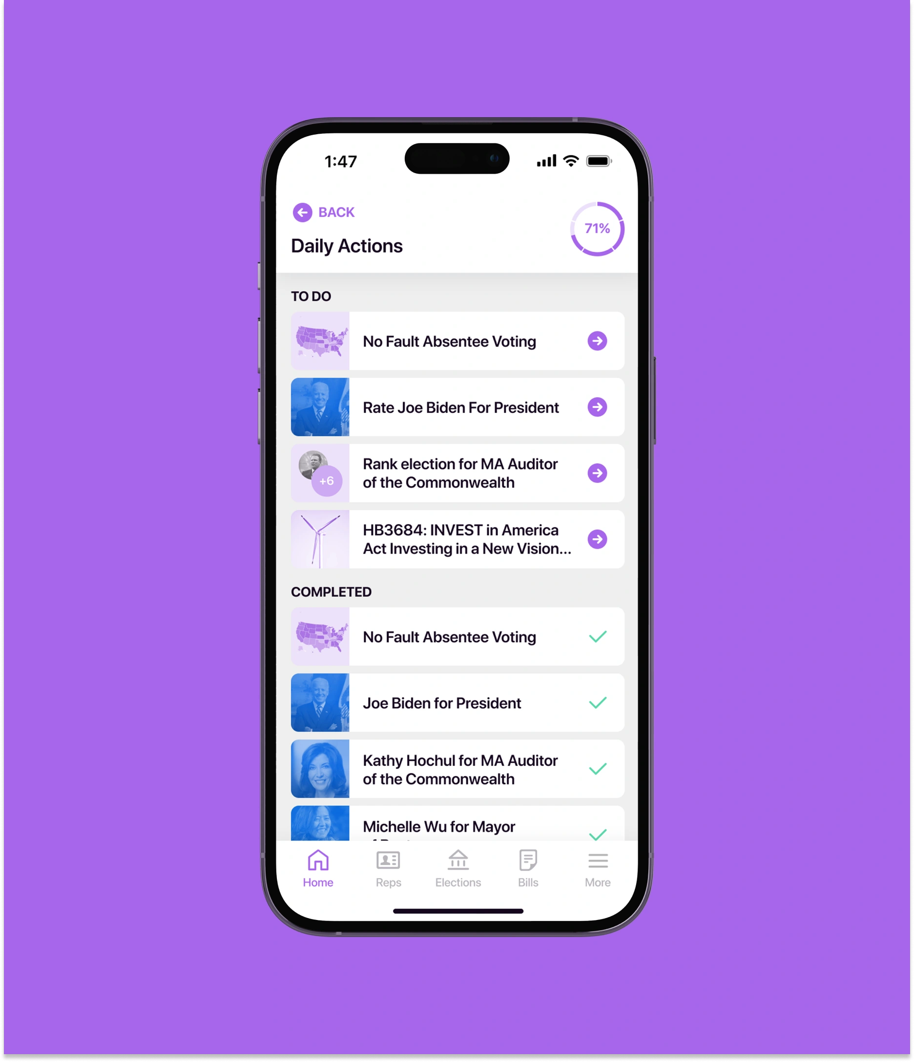
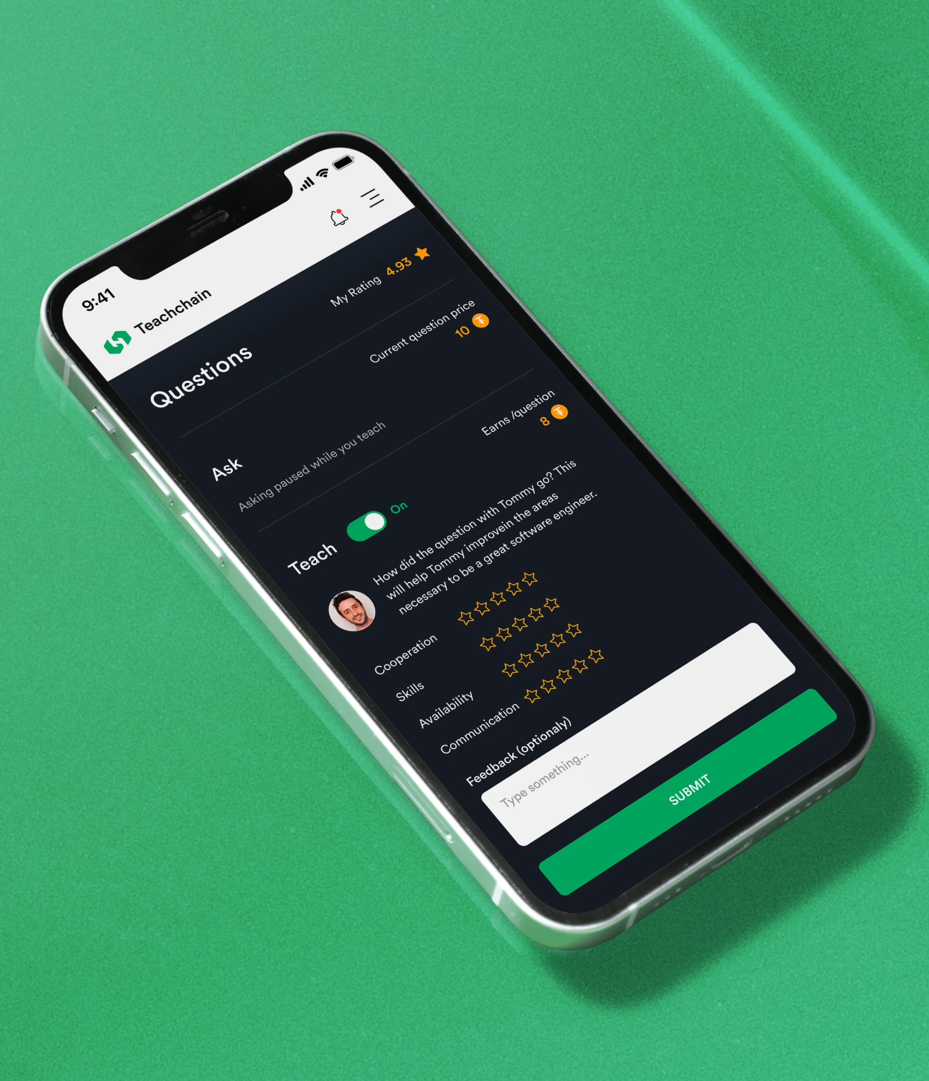
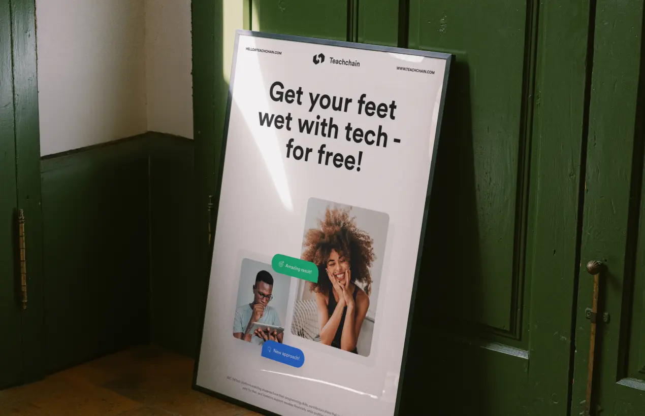
The enticing landing page prioritizes contributors and students, getting the platform up and running. Additionally, we crafted inviting social media banners and email designs, building a strong foundation of trust and engagement with the audience. To make learning easy on the move, our team designed a mobile interface of the data-rich B2C platform.
AI & ML
Lazarev. agency offers comprehensive digital design services. Discover our range of related expertise supported by impactful case studies.
More Startups Cases
FAQ
How can EdTech platform design improve user engagement?
A thoughtful EdTech platform design creates intuitive workflows, personalized experiences, and clear navigation, helping learners stay engaged and motivated throughout their journey.
How does design impact learner retention?
By simplifying complex learning processes and tailoring the interface for different personas, design reduces friction, making users more likely to return and continue using the platform.
How does UX research contribute to effective EdTech platforms?
UX research identifies user needs, pain points, and behavior patterns. Integrating these insights ensures that the platform meets diverse learner requirements while driving adoption.
How can design support multiple learner personas?
EdTech design allows customization of interfaces and features to match the expectations of different personas, ensuring each user has a seamless, relevant learning experience.
How does intuitive design streamline learning workflows?
Clear navigation, visual cues, and logical task flows minimize cognitive load, enabling learners to focus on content rather than struggling with platform mechanics.
How can design accelerate user acquisition for EdTech products?
A polished, easy-to-use interface creates positive first impressions, reduces onboarding friction, and encourages recommendations, which helps attract and retain new users.
Why is continuous design iteration important in EdTech platforms?
Learning needs evolve over time. Regularly refining EdTech platform design based on analytics and user feedback ensures the platform remains effective, engaging, and competitive.











.webp)
